After taking multiple still life photographs in workshops and in my own time, I was finally able to begin taking photographs for my final still life assessment while using all of the skills I have learnt over time so far and I applied them to the photographs that I took for my final piece. At first I was not sure on what objects I should use for my final piece – however, I finally came to a conclusion and ended up using three different objects – red roses, a perfume bottle and a moisturiser bottle. All of these objects relate to each other in the sense that they all link to the concept of beauty, which is obviously the main theme I am going for. Once I had decided to use these objects, I then thought about all of the photographers that I have previously researched and decided to think about how I should position the objects and what type of lighting I should use and once I had thought all of this through, I then decided to begin taking my photographs. Obviously, I came out with some good and some bad photographs and I will present the majority of the images I had taken and will then present my final photograph by the end of the post.
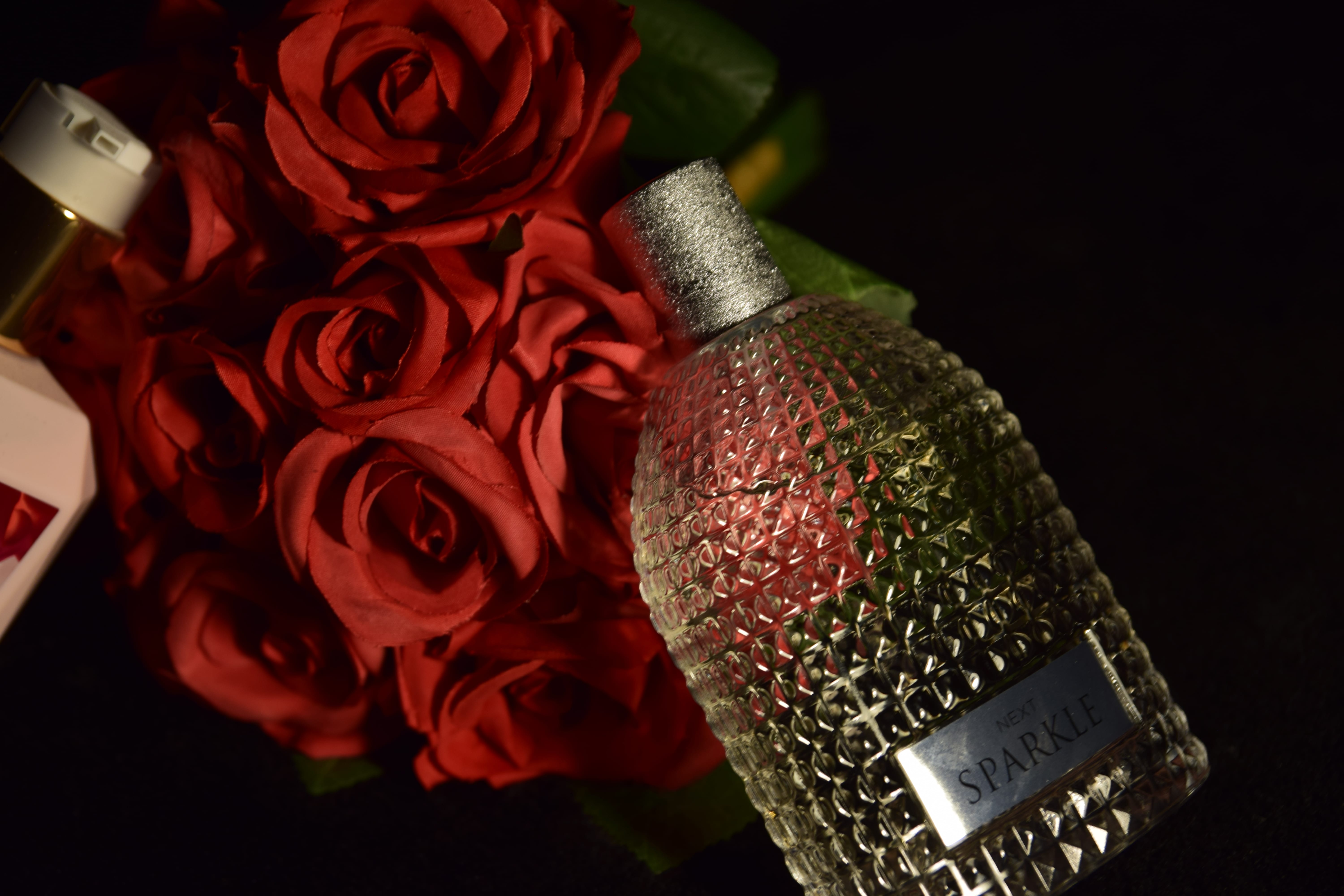
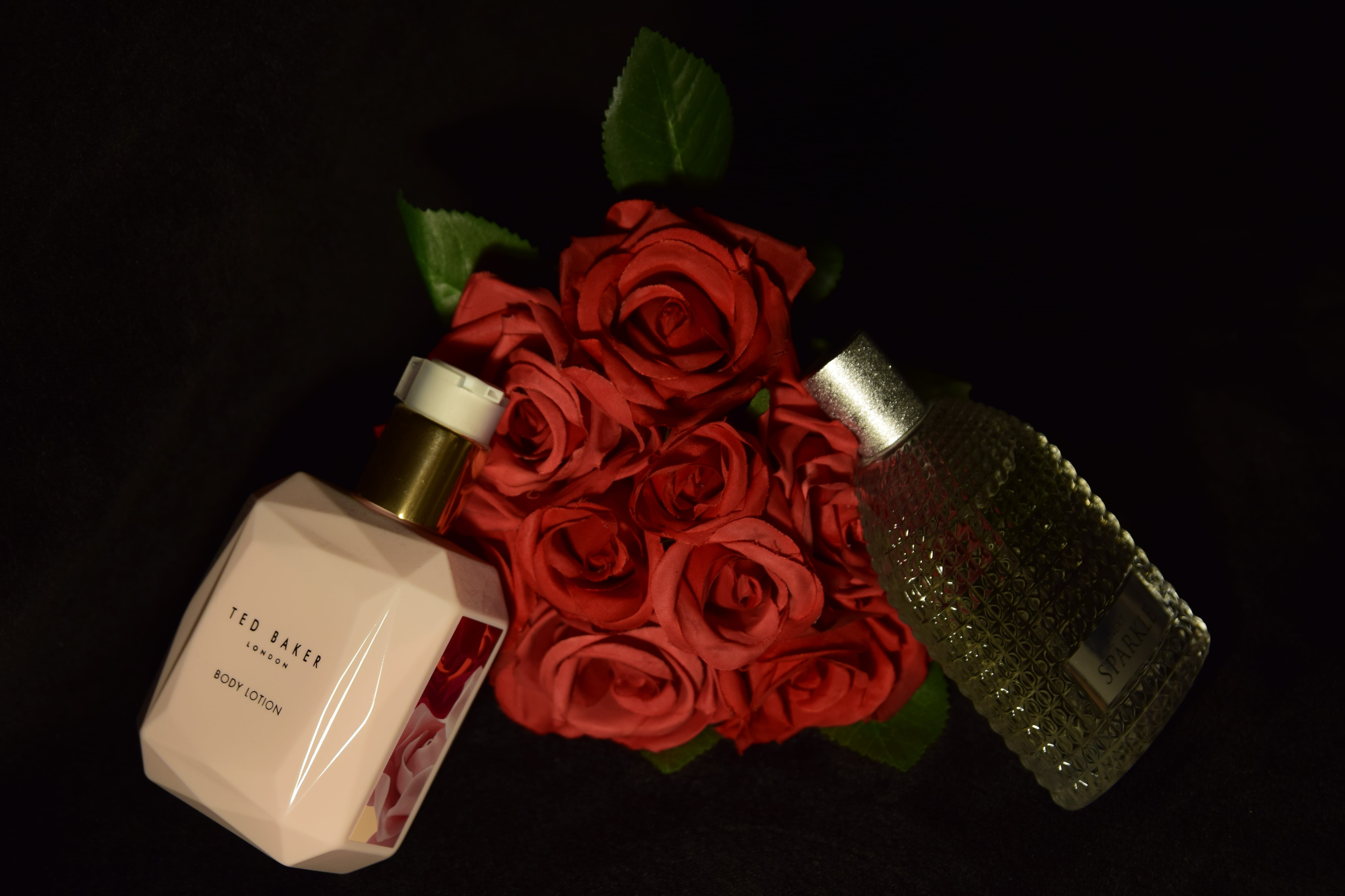
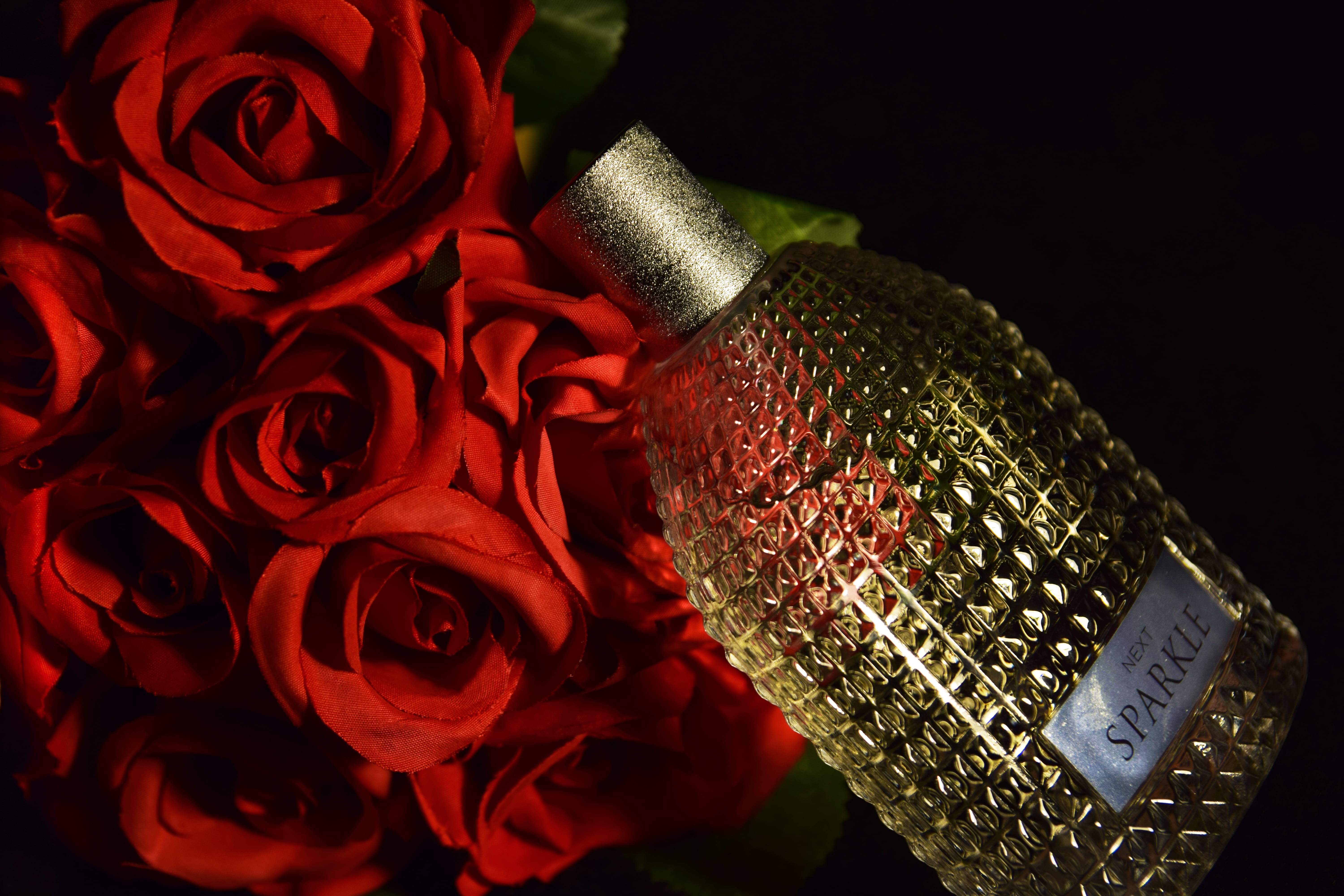
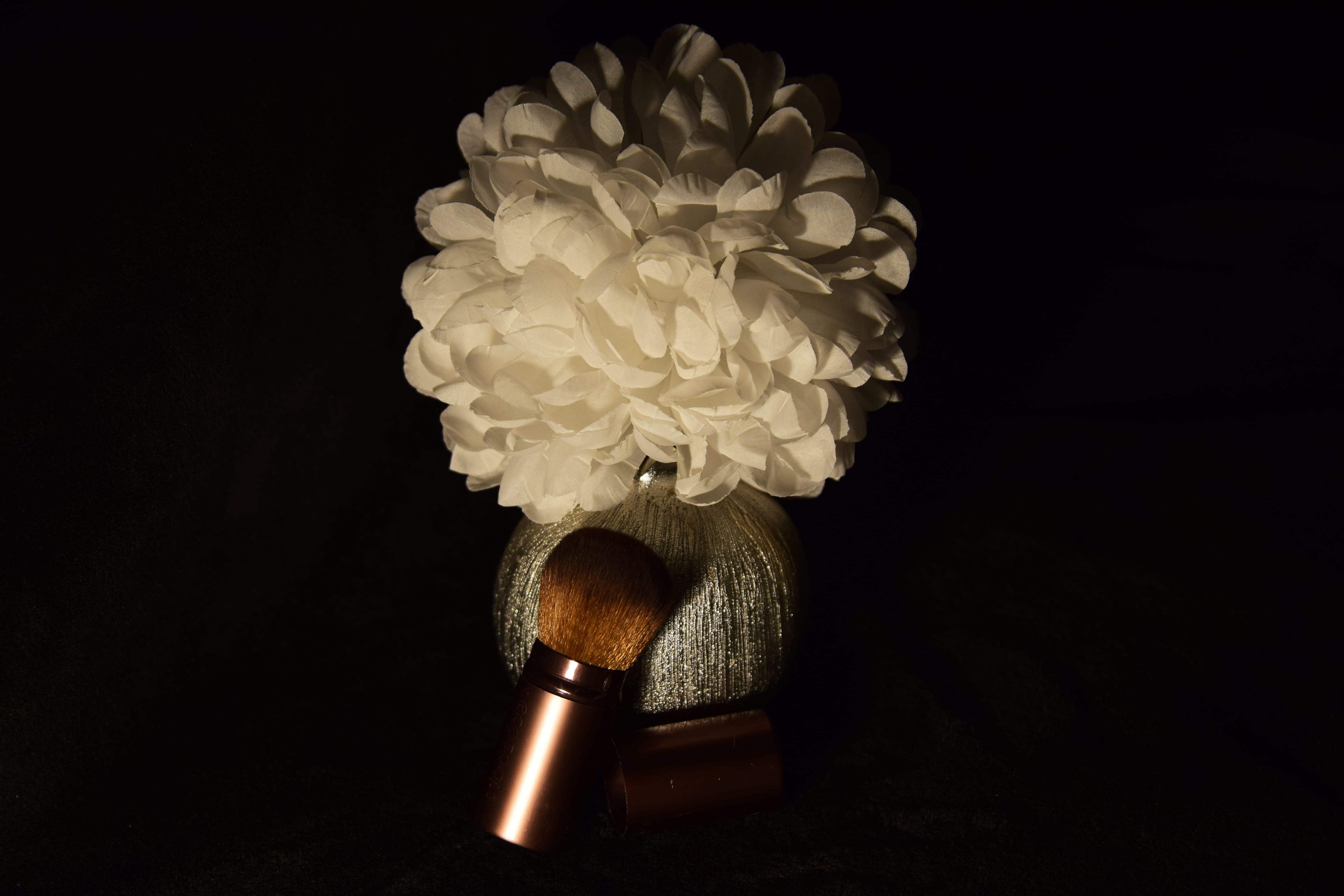
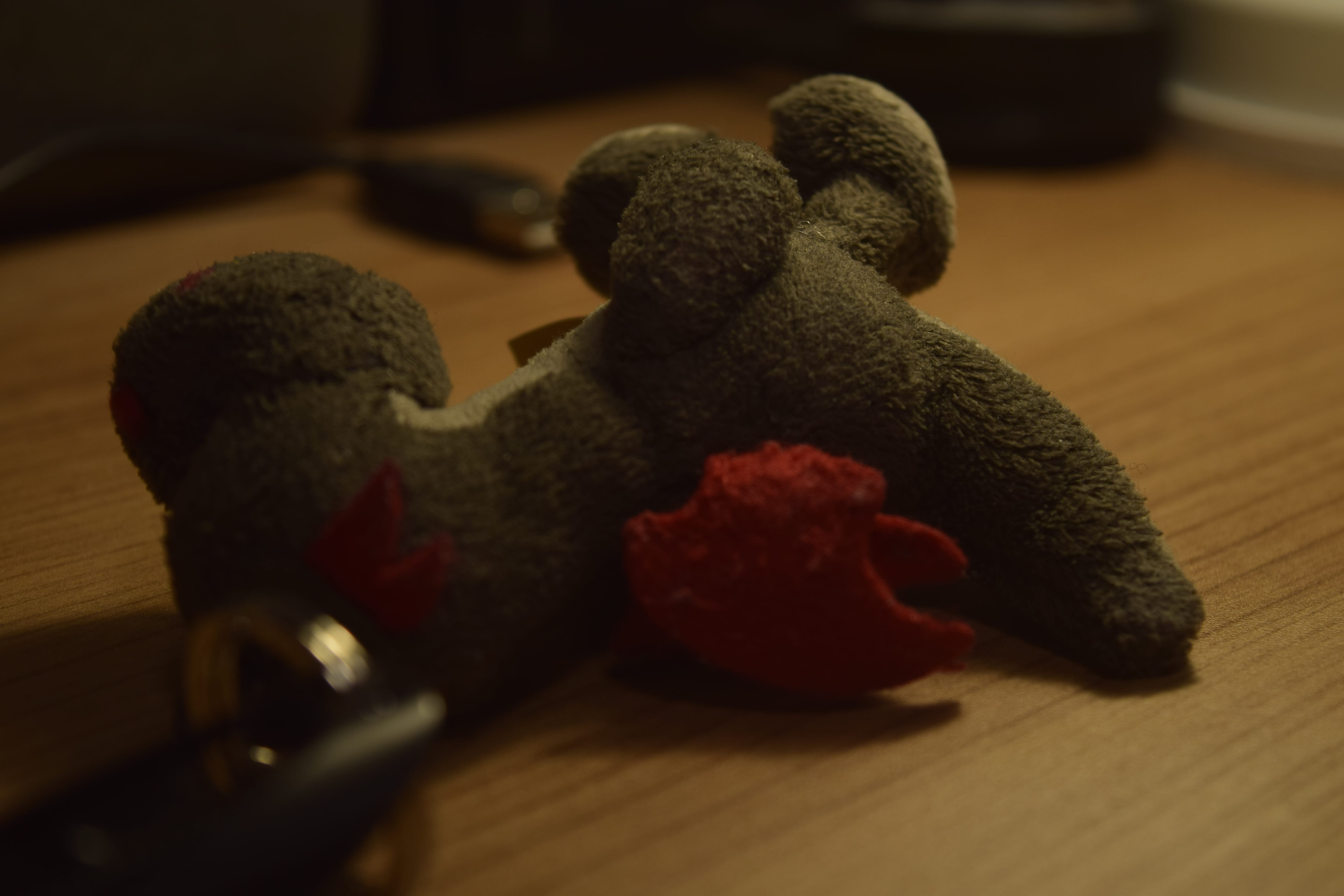
Here are some of the images I took, I believe that some turned out reasonable, while others did not turn out as good:
From looking at the photographs above, you are able to see that I did try various things out when taking these images for my still life assessment – when it came to the composition, I attempted to move around a lot rather than move the objects as I wanted to try out numerous angles to see which would be the best for my final photograph. In some of these images you are able to see that the composition is not that great as certain elements could either just be sticking in or out of the frame which does not look professional, but also some of the images have too much blank space (such as the first image) which makes the image look boring as the main objects cannot really be seen, so it is not appealing for the audience to look at. In relation to lighting, I know I wanted to stick with dark lighting, so when changing the lighting I know I didn’t want to make it really bright as I knew this is not how I wanted my image to be presented – however, I did change the lighting slightly from time to time which you will be able to see in the images. I think the lighting in some of these images is good – however, in others, I believe it is too dark and again makes it hard for the audience to see what the objects are, but also I think it is uncomfortable to look at the photographs because of how dark some of them are, so this is one of the main reasons some of these photos did not make it to being my final image. Nonetheless, if I did not take multiple images then I would not have come out with my final image that I am now happy with.
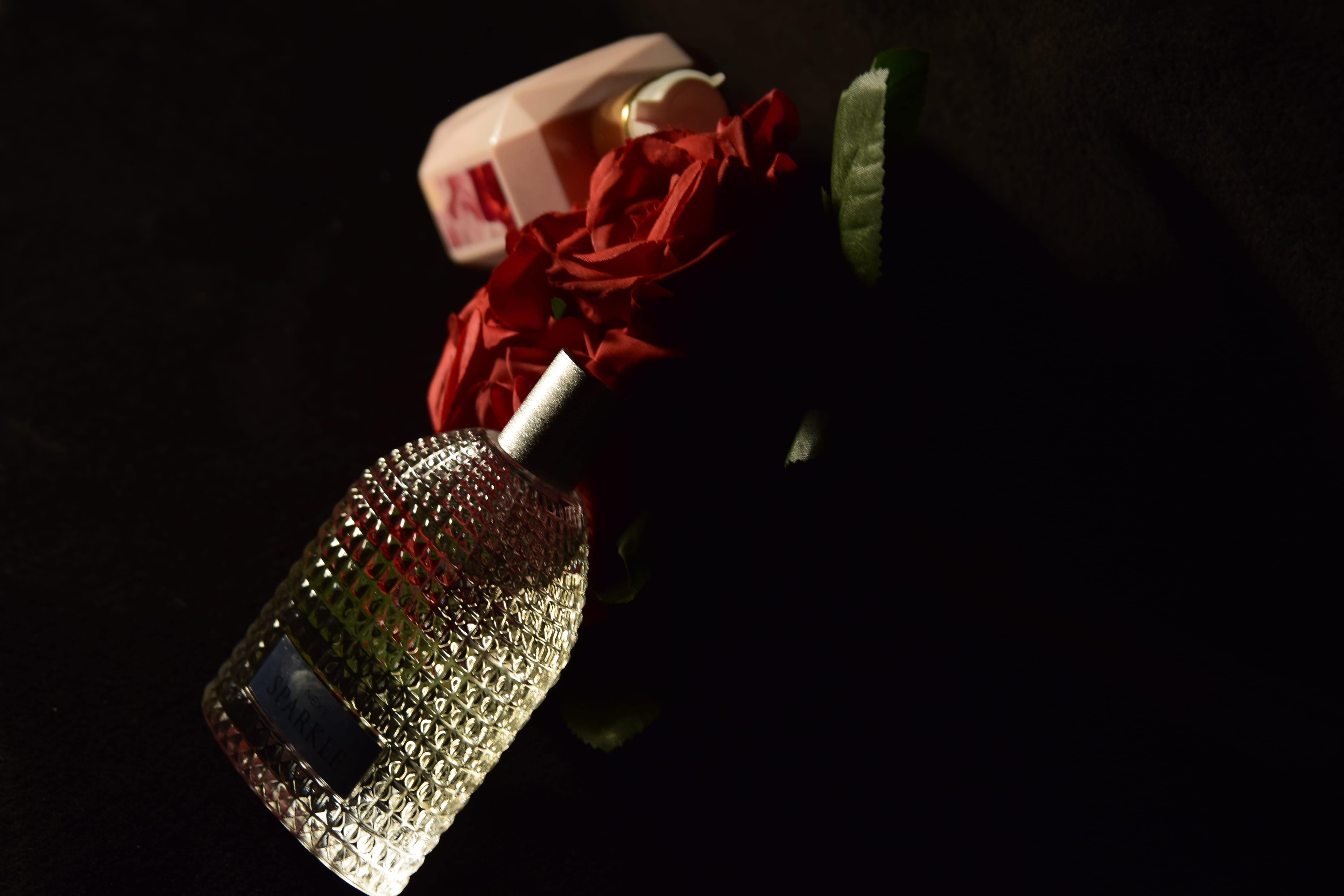
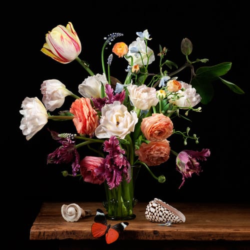
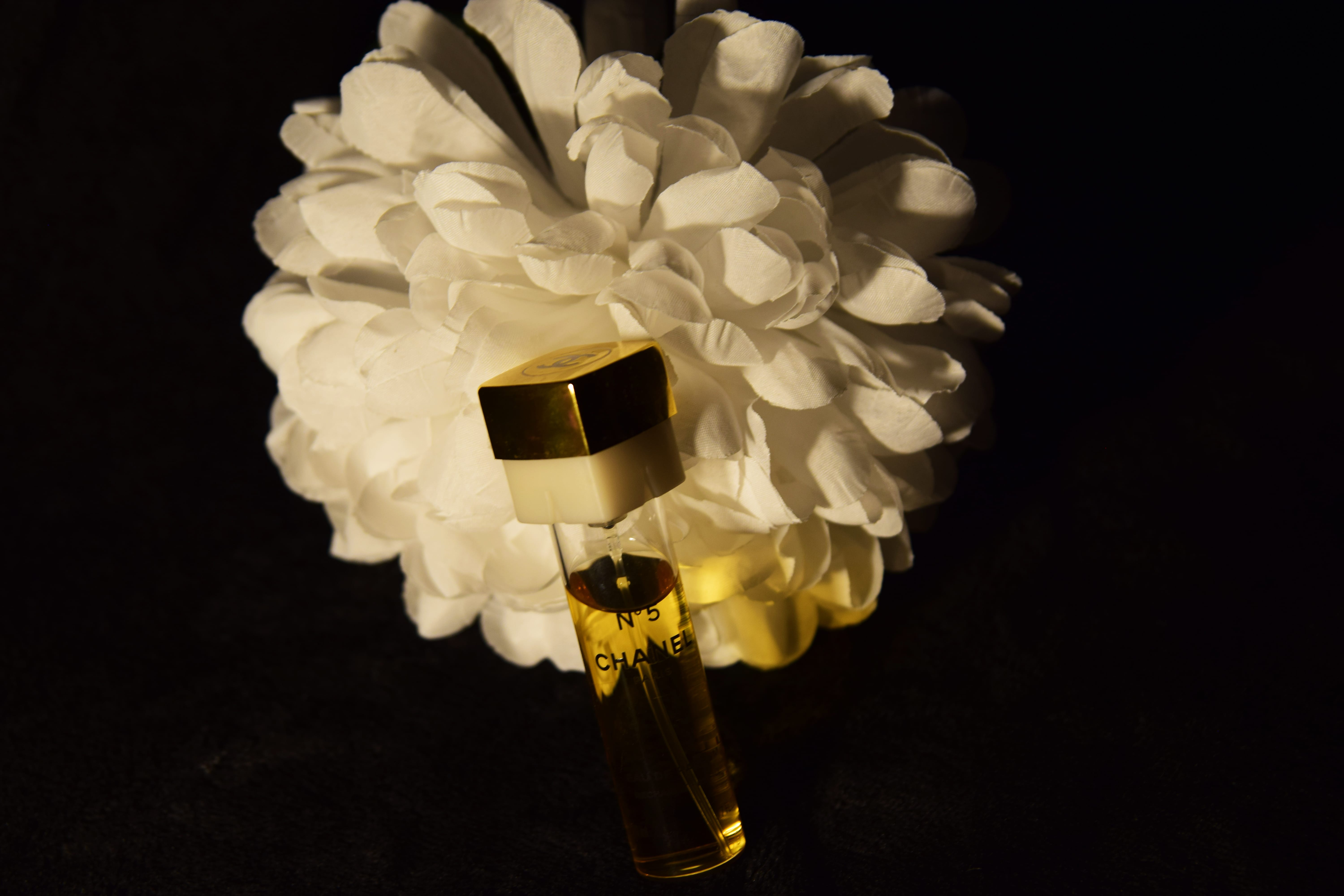
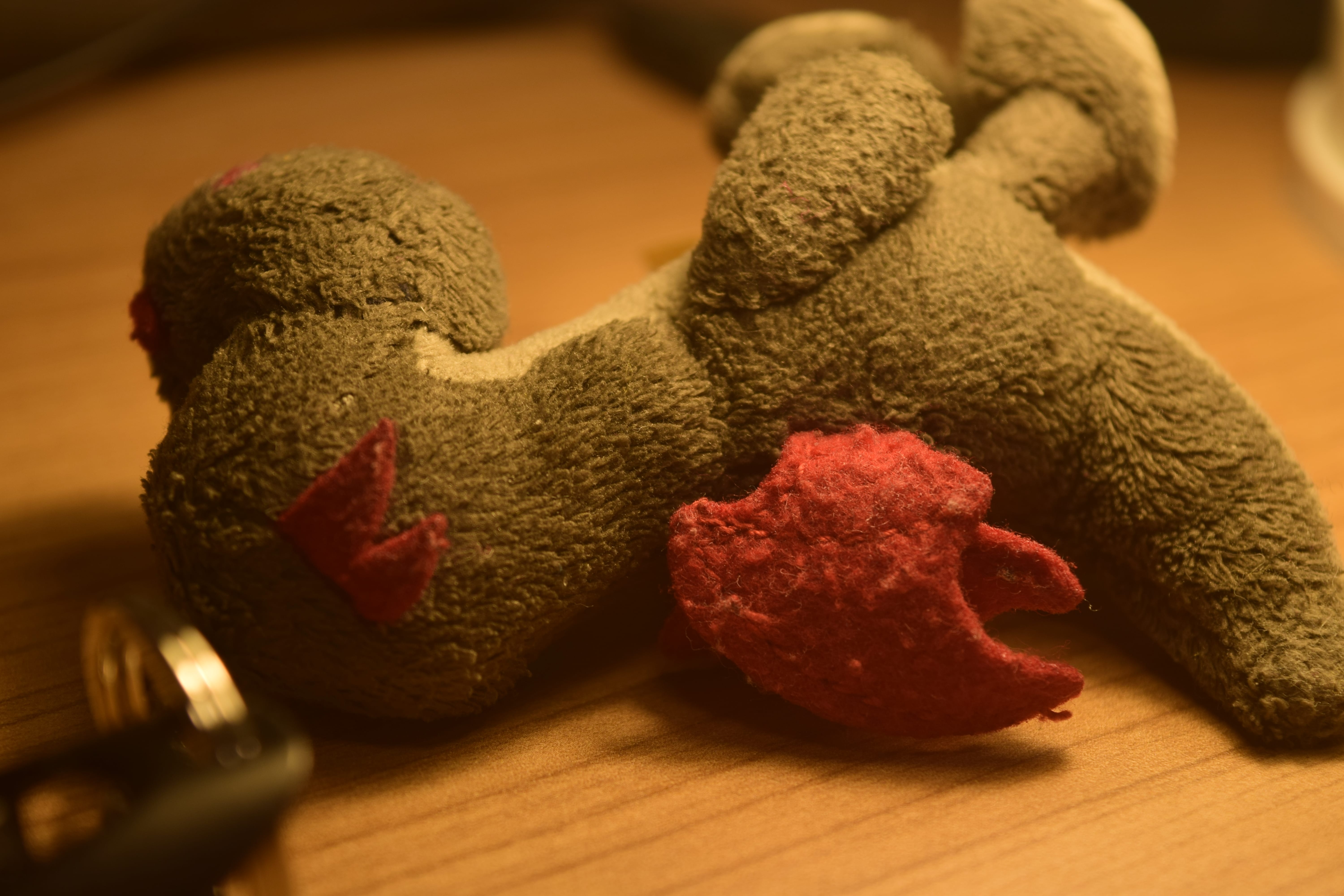
Here is my final photograph for my ‘Still Life Assessment’:
I chose this photograph to be my final image for multiple reasons – including, the lighting, composition, focus and the overall colour of the photograph. In relation to composition, I really liked this photograph because the objects do take up the majority of the photograph, but the background can still be seen slightly in the top right hand corner of the photograph. Also, I like how I made the perfume bottle lean on the flowers as it makes the overall image look more interesting and like the two objects are actually interacting rather than just randomly being placed next to each other. In relation to the lighting that has been used, I think that I have done well with it as the photograph is not too light, but at the same time, it is not too dark either – so the audience can clearly see the objects that are being displayed in the photograph. Moreover, I like the glare that is being shown on the perfume bottle as it is not too bright and makes the photograph more alluring and appealing to look at. Furthermore, the whole of the photograph is in focus which is good as it ensures that the audience know what to pay the most attention to in the image, but also I like the colours that I have used in the image – I did edit the image slightly after I had taken it to make the red from the flowers and the bottle stand out more, but I think this was an advantageous idea as it makes the objects in the photograph stand out more and is more attractive for the audience to look at.
Even though I have had some practice with still life photography and I have taken quite a few photographs up to this point, I still decided to do some more research to help me think of ideas for my final still life assessment, but also with the ideas I already have, I can look at photographers work that have used similar concepts to what I would like to use and think about how I could position the objects I will be including in my photographs and what type of lighting I should be using. My initial idea for my still life assessment is to use some sort of flowers and then additional elements that relate to the flowers – for example, perfume as it can relate to what the smell of the flowers are like. Moreover, I am thinking of using dark lighting and a dark background as I would like all of the attention to be on the objects and by using this type of lighting and backdrop, it will ensure that the elements in the photograph will stand out more so the audience will easily be able to see the objects and will pay more attention to them. As this is my initial idea, I decided to do some research in relation to photographers that have taken still life photographs of flowers and general cosmetics as these are the objects I will most likely use in my final photograph. Below you will be able to see the different photographers I have done some research on to help me with my final still life piece.
Paulette Tavormina
When looking at still life photography in relation to flowers I saw that Tavormina’s work looked really interesting and I decided to look at her work in more detail to see if anything that she had previously taken photographs of would inspire or influence me when it comes to constructing my own still life photograph. I mainly liked the look of Tavormina’s work due to the fact that I feel as if it has a very natural look because of all of the natural imagery that she uses in her photographs, but at the same time she also includes other imagery – such as fruits and wildlife – including: birds and butterflies, which again gives her photographs a very natural feel to them – which I think is appealing for audiences to look at. Below is one of Tavormina’s photographs that I think will inspire me when it comes to my own work:
Paulette Tavormina – Flowers and Butterfly, 2013
I mainly like the image I have selected from Tavormina due to the fact that again it has a very natural feel to it, which is represented through the use of the flowers, the butterfly and even the sea shells that have been placed beside the flowers. Furthermore, the use of colour that has been used is really intriguing as it is simple – however, it is eye catching for the audience and they will want to look at the photograph and take it all in. The lighting that has been used in the image has been thought out well as all of the objects that have been placed on the table are lit and can be seen clearly, but the background is dark and this makes the objects in the foreground stand out more due to the fact that nothing in the background can be seen. When it comes to my initial idea for my still life photograph, I am thinking of using lighting which perhaps may be darker than what Tavormina has used in this photograph as I would like the flowers to appear darker – however, this does depend on the type of flowers I will be using for my still life photograph because if I decide to use a light coloured flower (eg. white) I think I would like to use more light and include a lighter background – however, if I use a darker coloured flower (eg. red) I think I would prefer to use darker lighting to make the colour of the flower stand out more and appeal to the audience. On top of that, Tavormina has included other elements as well as the flowers, which again is something I would like to do in my own still life photograph to just make the composition of the overall image better, but when doing this I will have to ensure that all of the elements that are use will come together to make the image have a specific meaning which the audience will be able to understand. Overall, I really do like Tavormina’s work and think that it is going to be helpful to me when I finally start to take the photographs for my final still life assessment.
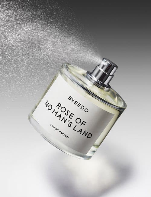
As I knew I wanted to include some type of cosmetics in my final still life photograph, I decided to do some research in relation to photographers who do still life photography with cosmetics and one of the first photographers that I found was Josh Caudwell. I decided to look at his work in more detail and although he is more extreme and intense with the photography he does with cosmetics, I still like the work he has constructed and believe that it could possibly give me some ideas for how I will want the cosmetics in my photograph to appear on the image overall. A lot of the photographs he has taken have been heavily edited and are not the type of thing I am looking at doing – however, I do find it interesting and I believe I will use some of the elements he has used in my own final still life photograph. Underneath you will see one of Caudwell’s photographs that I think will be inspirational to my own still life photograph:
Josh Caudwell
If I were to include perfume in my own still life photograph, then I believe that I would present it in a similar way to how Caudwell has demonstrated it here – however, I will most likely not have it being sprayed as I believe this would be unnecessary for my photograph as I will hopefully also be including flowers in it and I believe that the spray of the perfume will not be needed. I like this photograph for many reasons and one of them is that I like how simple it is, which is demonstrated through the use of lighting and composition. In relation to composition, there is not too much or too little occurring in the photograph – meaning, the audience will know exactly what to be looking at in the photograph and will not get distracted by anything else. Moreover, the lighting that has been used is good as you are able to see that it is darker at the top of the photograph than it is at the bottom – which presents the contrast towards the audience, but also you are able to see a slight shadow of the perfume bottle which presents that the bottom is actually near a flat surface and is not just floating in the air. The overall lighting that has been used in the image is intriguing and appealing to look at as the audience is clearly able to see everything in the photograph that needs to be seen and also the label on the perfume bottle stands out clearly, so the viewer will know which perfume is being advertised and will then hopefully purchase it. Overall, as I said before, I do like all of the work Caudwell has done – however, I do not feel like all of the photographs he has taken would influence me, but there are some that will (the image above for example) and because of this I feel like if I ever have any issues with composition or lighting when it comes to the cosmetics I will be including in my final still life photograph, then I will look at Caudwell’s work.
Drepina is another photographer that likes to take images of flowers and other nature related elements – however, she does also take photographs of other features – such as: people and landscapes, so this means that she works with different genres of photography, but I will mainly be looking at the still life work she has done which will hopefully inspire me for my final still life photograph. What I really like about Drepina’s work is how she uses a lot of dark lighting to get a deeper meaning across to the audience, but also to ensure that the subject in the photographs stand out and will be noticed by the audience. A lot of photographs tend to keep the background really dark and then ensure that the foreground is lighter, but Drepina likes to keep both the background and foreground dark and will then light certain parts of the foreground to ensure that the subject can be seen and I think this is really alluring due to the fact that it essentially shows the darker side of objects and what emotional impact they may have on the audience. Below you will be able to see one of Drepina’s photographs I chose that I believe is going to be influential to me and my work:
Natalia Drepina – The Whisper of Dying Flowers In My Dark Room
I really like all of the different elements that have been used in this photograph – including the subject that has been used, the lighting and even the composition. If you look at the photograph very quickly then you will realize that is is quite dark – however, I believe that this has a powerful effect as it ensures that the flowers themselves stand out to the audience more, but even the flowers have been lit with dark lighting, so this may express that Drepina’s intentions was for the audience to interpret this photograph with a dark meaning in mind as the flowers themselves could potentially represent life and death as one of the flowers is positioned upwards and the other is laying on the floor, so the use of the dark lighting emphasizes this idea. Moreover, as a dark background has been used, it makes sense that there are no objects positioned on the left or right of the photograph as this would make the photograph look too busy – meaning, individuals would not want to look at is as there would be too much going on, so overall, the composition of the photograph is good. As I have said previously, my initial concept for my final still life photograph is to use dark lighting on my subject to express a dark feeling towards the audience – however, I do not think I will use lighting as dark as what Drepina has used as I would not like my photograph to be as gloomy and obscure as the Drepina’s photograph that I have presented above. Nonetheless, I would like to use dark lighting, but will need to ensure that the subject in the foreground will be correctly lit and that the audience will actually be able to see it. Overall, I think that Drepina’s work will be really influential to me and will help me in ensuring that I present the objects in my photograph in the correct way and that the overall image will be appealing to look at from the audiences point of view.
For our week 5 photography workshop, our tutor asked our group to start taking still life photographs in our own time and come to this weeks workshop with three still life images that we like that most, which had been taken in our own time – this meant that we had to take photographs with our own objects, or any objects that we would be able to collect. When we actually went to the workshop, everyone in the group looked at all of the images that everyone had taken and we all explained what we liked about them and how they could be improved – this was beneficial as it enabled everyone to have their own point of view on the images and they were able to describe how they think they could be improved to ensure that the photographs could possibly appeal to multiple audiences. Due to the fact that I do not own very many interesting objects that could be photographed, I decided to ask people I knew if I could use some of their objects and this would enable me to construct some interesting still life images. All of the photographs I took were taken in my bedroom, where I did use external lighting to ensure that I could make the photographs look the way I wanted them to look and that they would have interesting and striking lighting that would appeal to the audience.
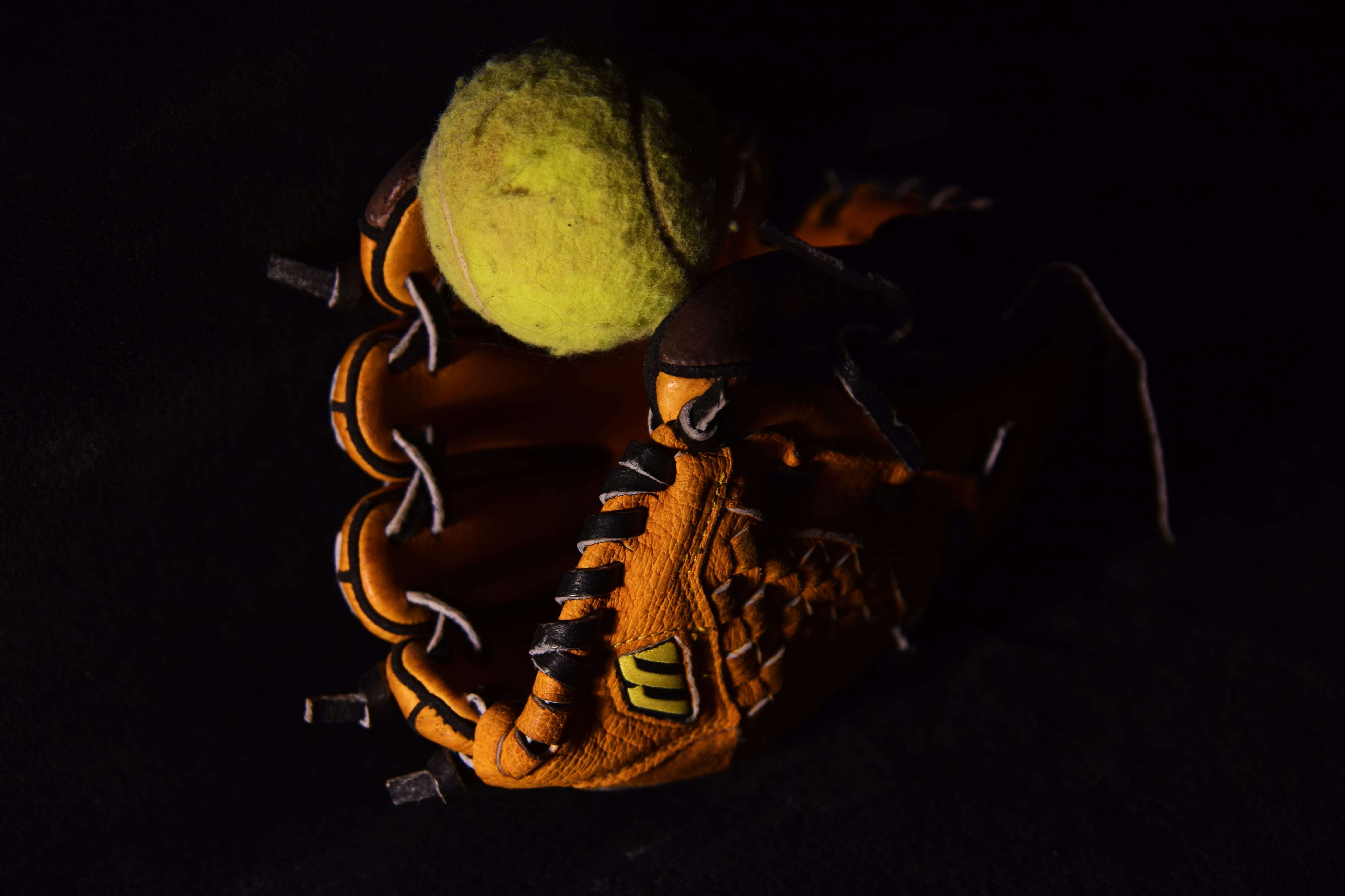
Here are the final 3 images I decided I liked the most:
When taking these photographs, I noticed that I had to take the images from multiple different angles to ensure that I got a shot of the objects from the best angles and that the photographs would turn out as well as possible. I personally like all of these images, but I know there are ways that I could improve them. When looking at it now, I can notice that some of the images may perhaps be a bit took dark – for example, I think the images with the flower could be brighter to make it stand out more, or even a different coloured backdrop could be used – however, in the image with the baseball glove, I like the lighting that has been used as I feel it is more intriguing for the audience to look at and essentially just blends all together to make the image itself look good. Except from the lighting and use of background colour, I think the rest of the elements in the photograph are good as they are all in focus and I think the composition has been thought out well. All in all, I think doing this task has again benefited me to ensure that I can get more practice with the camera and that I can see what is good when it comes to taking photographs and what is not as good – therefore, I now have a greater understanding on what I should include in my images and what I shouldn’t, but also how I should demonstrate them towards the audience.
During our Photography lecture this week, we were told that we would have to complete a task in relation to ‘Still Life’ – however, we would go through this in more detail when it came to our workshop. Our workshop this week was essentially split into two – for the first hour of the workshop, our tutor went through a range of examples of still life images by existing photographers to hopefully inspire us and enable us to think of ideas for either our still life assessment or our overall project – nonetheless, all of it was very interesting. After our tutor had finished talking about these different artists and their photographs, we were then told that we were able to practice taking photographs in relation to ‘Still Life’ in the classroom. All of the camera equipment was provided to us in the room and also there were a range of objects available to us to enable us to take a range of different photographs so we would be able to practice taking still life images, which we would be able to take into consideration for when we do our own still life images, but at the same time, for our final project. In this hour of taking photographs I did get a range of different images of various objects and again, due to the fact that I am still getting familiar with the camera, some of these photographs turned out well, while others did not. Below, you will be able to see both the good and bad photographs I took during this workshop session.
Here are the images that I believe are good to a certain extent:
It is obvious to see that these photographs are not perfect – however, as I am still becoming familiar with the camera, I believe that they are reasonable enough. When I first started taking images for this task during our workshop, I tended not to change the ISO on the camera, which meant that some of the images seemed quite light and didn’t look very interesting. However, as I began to take more images, I then decided to lower the ISO to make the images a bit darker and to make them look more interesting and appealing. Again, the lighting in some of these images is not perfect, but as I begin to take more photographs in time, I believe that my photography skills will improve. Moreover, in some of these photographs, you are able to see that the position of the camera is not the best due to the fact that in some of the images you are able to see the table or the wall in the background, which is not intentionally meant to be seen, but also some of the images appear to be a little wonky – so a tripod should have been used for some of these. Nonetheless, I am pleased with the images I have come out with for this workshop task as it has enabled me to see what I still need to improve on, but also it allowed me to become more familiar with the ISO settings, which I was not completely certain about previously.
Here are the images that did not turn out as well as the others:
As I took a range of photographs during this workshop, there were both good and bad images that were taken and from the images above, you are able to see that they are the bad images. When taking photographs for this workshop, I wanted to try out a range of different things and this meant that some of the images were bound to turn out poor. From looking at these images, you are able to see that the main issue a lot of the time was either lighting on the subject or the focus on the subject. As I began to change the ISO after taking a few images, I knew that some times the ISO was too low, so this meant that the images appeared to be really dark – nonetheless, I was then able to increase the ISO again to make the images appear brighter. In one of these images, you are able to see clearly that an external light source has been used and this is good in a sense as it casts a shadow of the subject – however, as an image overall, it does not look as good and the light source should have perhaps been further away from the subject, or a different light source should have been used. Overall, I am glad that I did come out with some bad images as it enables me to see where my issues may lie and how I will be able to improve on them in the future.
During our week 2 workshop, our group was given a talk on how the camera operates and how we should use them in more detail. After everything had been explained to us, we were then told to take images of an object that we had brought to our workshop, which we were told to bring the week before. This meant that for the rest of the workshop, we were split into smaller groups and had to individually take turns in using the camera and taking photographs of the object that one of the people in our group had brought in. Unfortunately, we did not save these photographs that were taken, so I am unable to put them on my blog. However, during this workshop we were actually supposed to go outside and stay on the University’s campus and conform to a checklist of various shots to enable us to practice with the camera more. As this did not occur in week 2, we were told in week 3 that we would have to do all of these shots in our own time – however, it was optional whether we did complete the checklist or not. We did not complete the checklist in our workshop in week 3 due to the fact that we were taken through the process for our seminar task as there had previously been a confusion about it. Nonetheless, I wanted to complete the majority of the shots on the checklist to enable me to practice with the camera and become familiar with all of the elements that are featured on it.
Before actually going out on campus and taking pictures that conform to the checklist, I decided to test the camera out in my bedroom to ensure that I know what all of the controls do and that I would basically be familiar with the whole of the camera before I actually went out and took any images. When doing this I believe that I did take both good and bad images – however, I was getting familiar with the camera, so there were bound to be issues when I took these images.
Here are some of the images I took that I believe to be good for my first attempt:
Although these photos are not perfect, I believe that they good for a first attempt – especially due to the fact that I was in a badly lit bedroom and the only lighting I had was my main bedroom light, my lamp and the natural light coming from the window. I like how I have used a shallow depth of field in some images to make a particular object stand out more in the images, or even a particular feature on a specific object to stand out. I decided that I just wanted to practice with the camera, so I decided to get any object that I could find in my room and then photograph it to enable me to practice with the camera. Overall, I believe that these are the images that came out well when it came to using the camera before I actually went out and took shots that were on the checklist.
Here are some of the images I took that I believe did not turn out well:
From looking at these images you are able to see that the main reason they turned out bad is due to the fact that the lighting is either really dark or the camera is out of focus which is one of the main issues that occurs when it comes to bad photography. I mainly shot these type of images when I first started taking photographs and this was mainly due to the fact that I did not have the camera set on the options that were needed for the location I was sitting in, but also I was still trying to get used to the camera and all of the features on it, so I was unsure on what options needed to be selected when I was taking certain photos. Overall, I am able to see where my main issues may lie when it comes to taking photographs and I will be able to keep these in mind when I come to taking more photographs in the future.
Once I had practiced with the camera in my bedroom to get more familiar with it, I then decided to actually leave my bedroom and take images of the majority of the shots that I had been asked to do that were on the checklist. When I went out to take these images I knew that all of the photos would not turn out perfect as this was still my first time using the camera – however, by taking all of these different shots I was able to become more familiar with the camera and just keep practicing to hopefully ensure that I will improve the more I practice. Below you will be able to see the photos I had taken for this task, where I have included the name of the shot that was on the checklist under each specific image, so you are able to see which image corresponds to which shot on the checklist.
Here are the images I took that conform to the checklist:
Wide AngleAt the closest focus distance possibleA huge depth of fieldA shallow depth of fieldFreezing a moving objectUsing the on board flashA low angleA high angleBlur a moving subject, keeping the background sharp
From looking at these images, you are able to see that there are issues with some of them – these issues are are mainly the lighting, focusing and positioning of the camera. Again, this was my first attempt at using the camera, so I knew that I would be making mistakes when taking these images, but the whole reason I took these shots that were on the checklist was to enable me to become more familiar with the camera and to ensure that I knew what I was doing when using it. In some of these images I noticed that they were either quite dark or too light and this meant that I should have changed the ISO on the camera to ensure that I had the right amount of light sensitivity for my images. Overall, some of these images are actually reasonable and others not so – nonetheless, I believe that doing this task was beneficial to me as it enabled me to become more familiar with the camera and enabled me to see where my main issues may lie and how I will need to improve on these for my final project.