After taking multiple still life photographs in workshops and in my own time, I was finally able to begin taking photographs for my final still life assessment while using all of the skills I have learnt over time so far and I applied them to the photographs that I took for my final piece. At first I was not sure on what objects I should use for my final piece – however, I finally came to a conclusion and ended up using three different objects – red roses, a perfume bottle and a moisturiser bottle. All of these objects relate to each other in the sense that they all link to the concept of beauty, which is obviously the main theme I am going for. Once I had decided to use these objects, I then thought about all of the photographers that I have previously researched and decided to think about how I should position the objects and what type of lighting I should use and once I had thought all of this through, I then decided to begin taking my photographs. Obviously, I came out with some good and some bad photographs and I will present the majority of the images I had taken and will then present my final photograph by the end of the post.
Here are some of the images I took, I believe that some turned out reasonable, while others did not turn out as good:
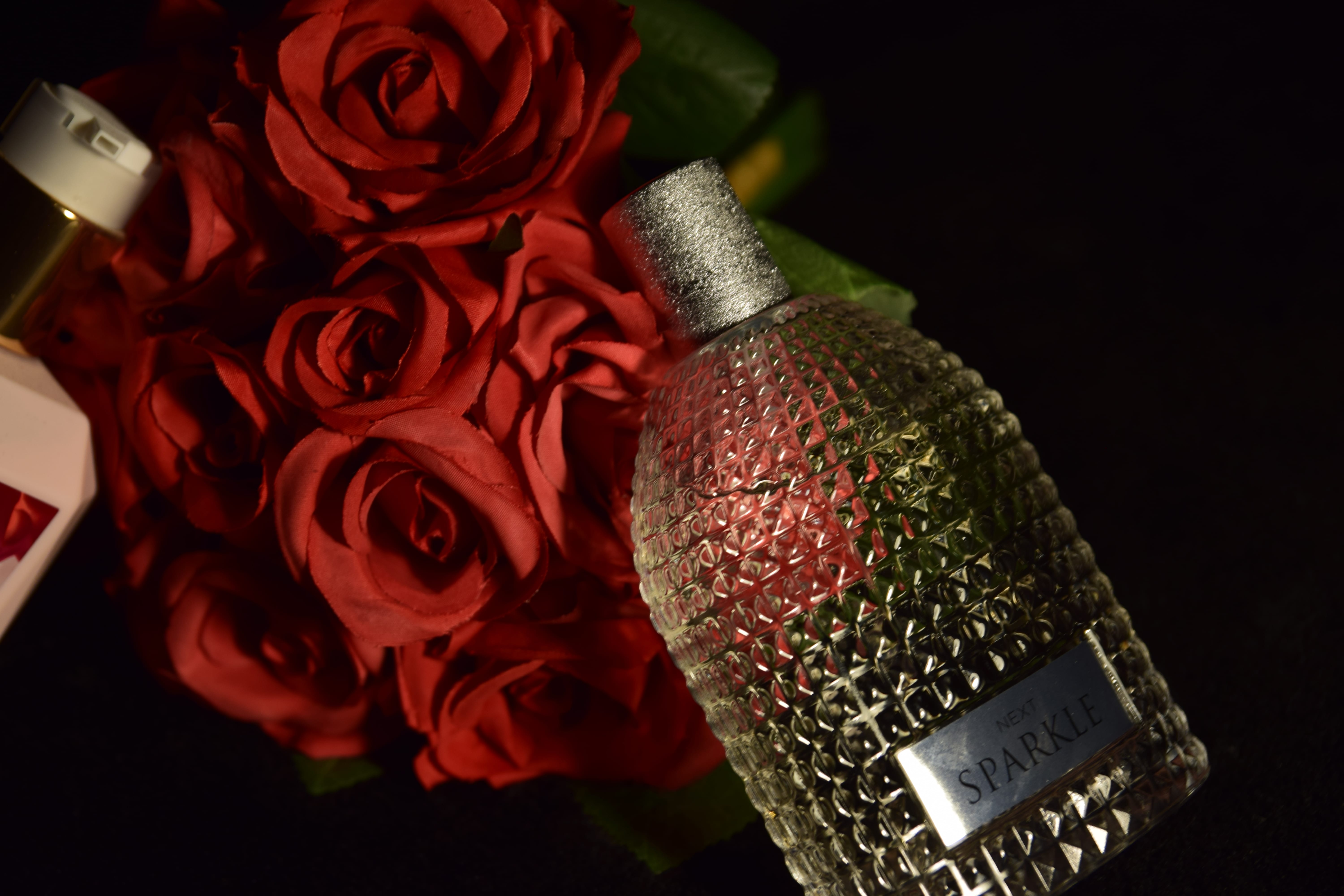
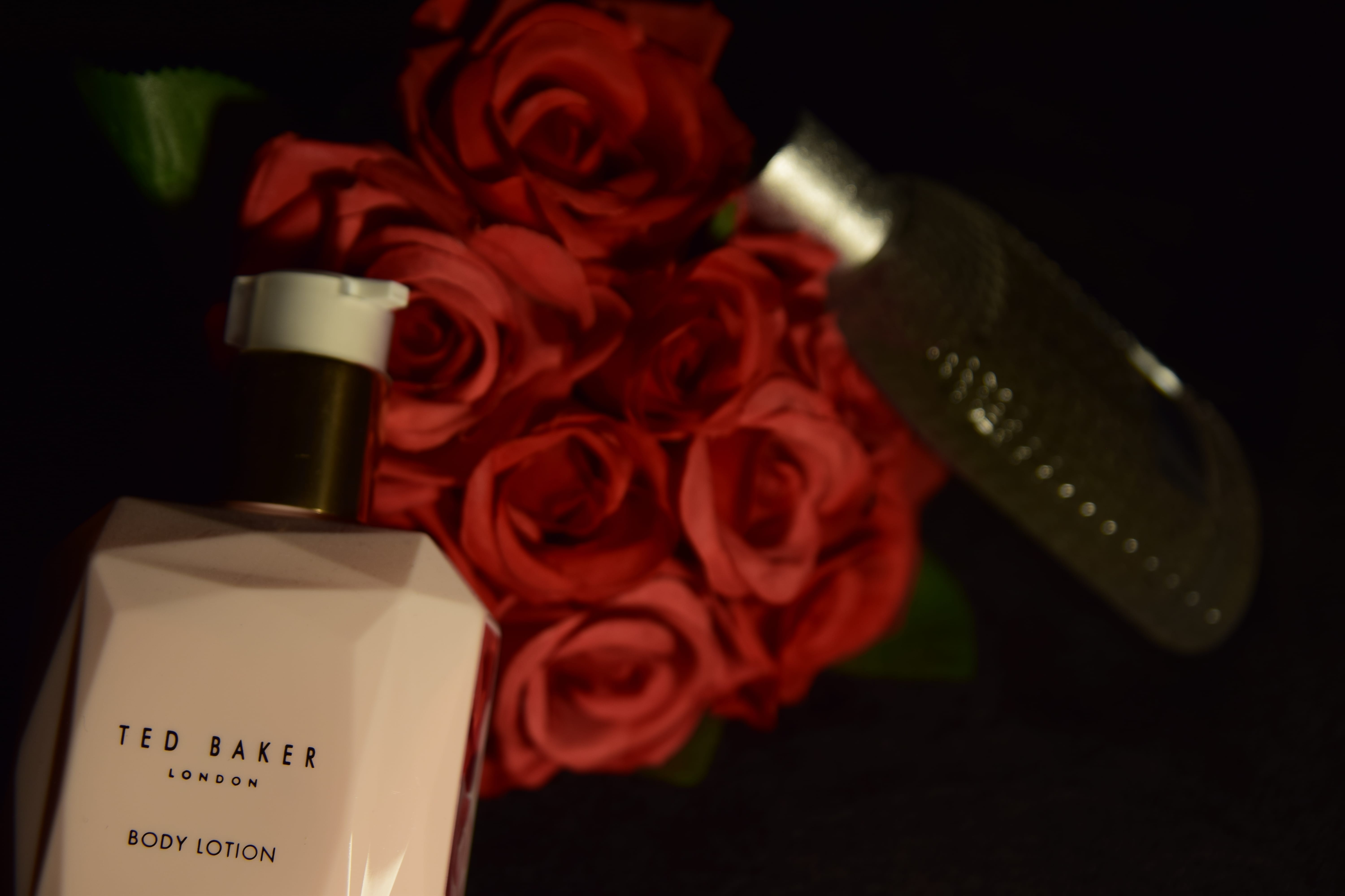
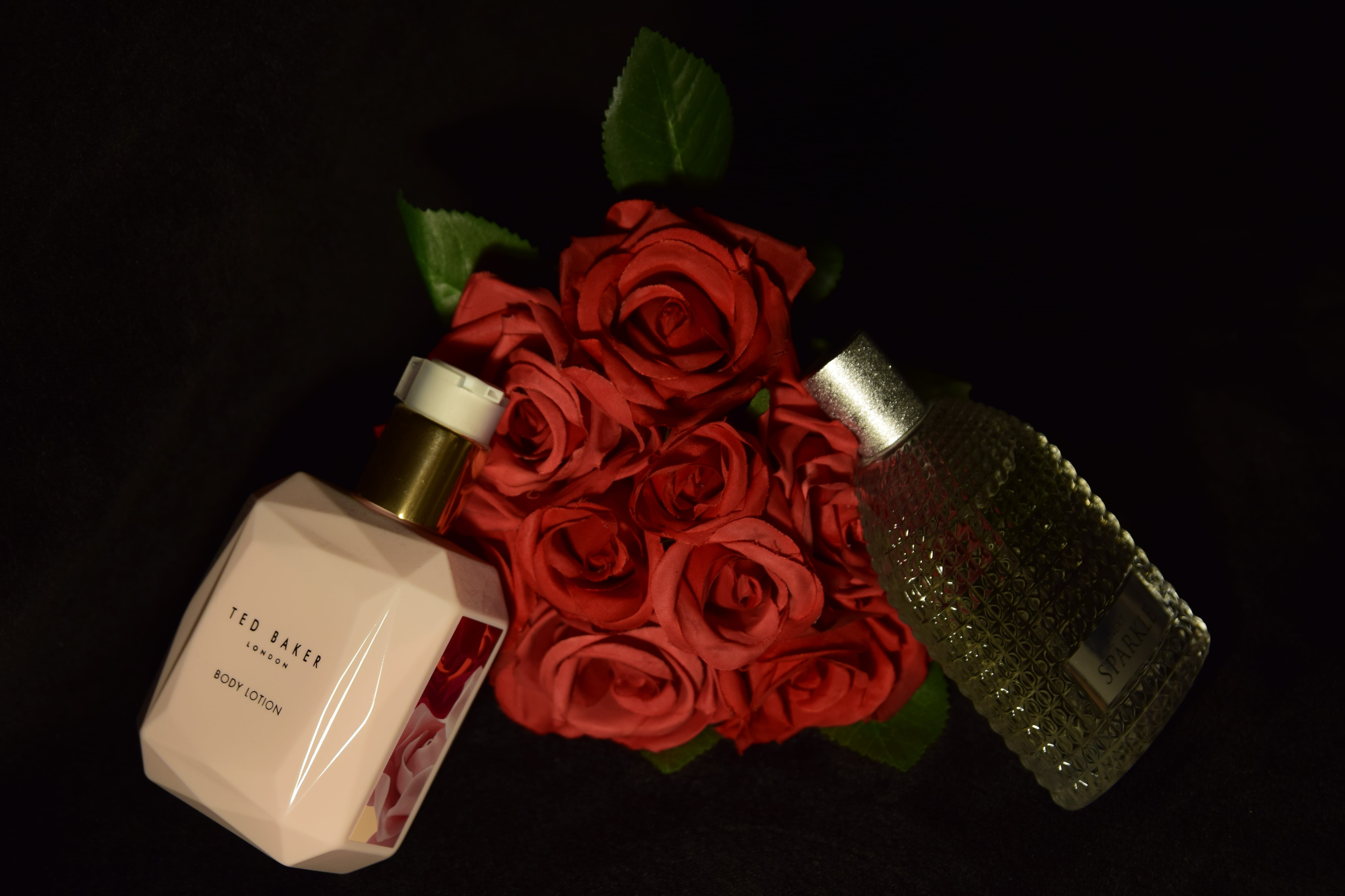
From looking at the photographs above, you are able to see that I did try various things out when taking these images for my still life assessment – when it came to the composition, I attempted to move around a lot rather than move the objects as I wanted to try out numerous angles to see which would be the best for my final photograph. In some of these images you are able to see that the composition is not that great as certain elements could either just be sticking in or out of the frame which does not look professional, but also some of the images have too much blank space (such as the first image) which makes the image look boring as the main objects cannot really be seen, so it is not appealing for the audience to look at. In relation to lighting, I know I wanted to stick with dark lighting, so when changing the lighting I know I didn’t want to make it really bright as I knew this is not how I wanted my image to be presented – however, I did change the lighting slightly from time to time which you will be able to see in the images. I think the lighting in some of these images is good – however, in others, I believe it is too dark and again makes it hard for the audience to see what the objects are, but also I think it is uncomfortable to look at the photographs because of how dark some of them are, so this is one of the main reasons some of these photos did not make it to being my final image. Nonetheless, if I did not take multiple images then I would not have come out with my final image that I am now happy with.
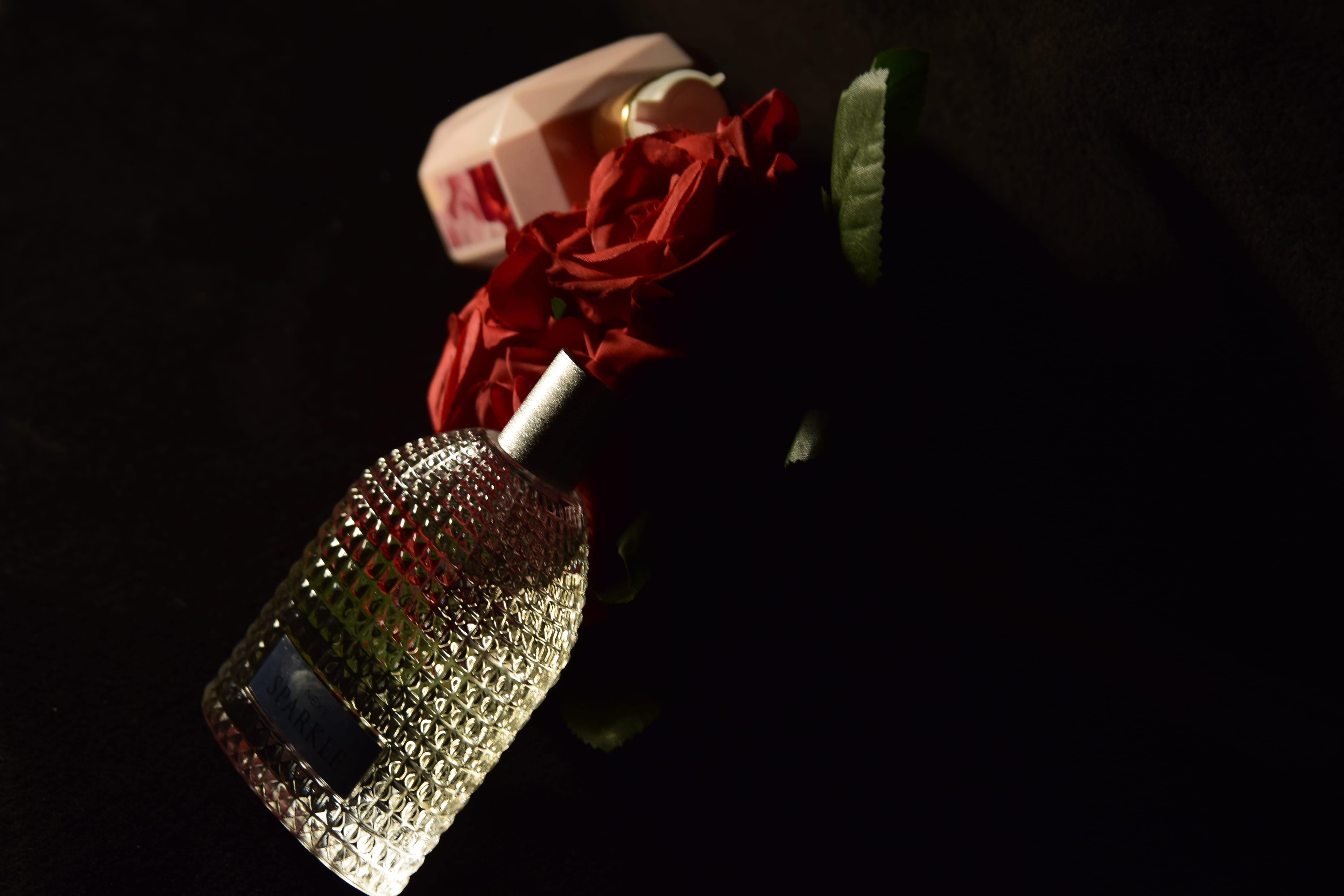
Here is my final photograph for my ‘Still Life Assessment’:
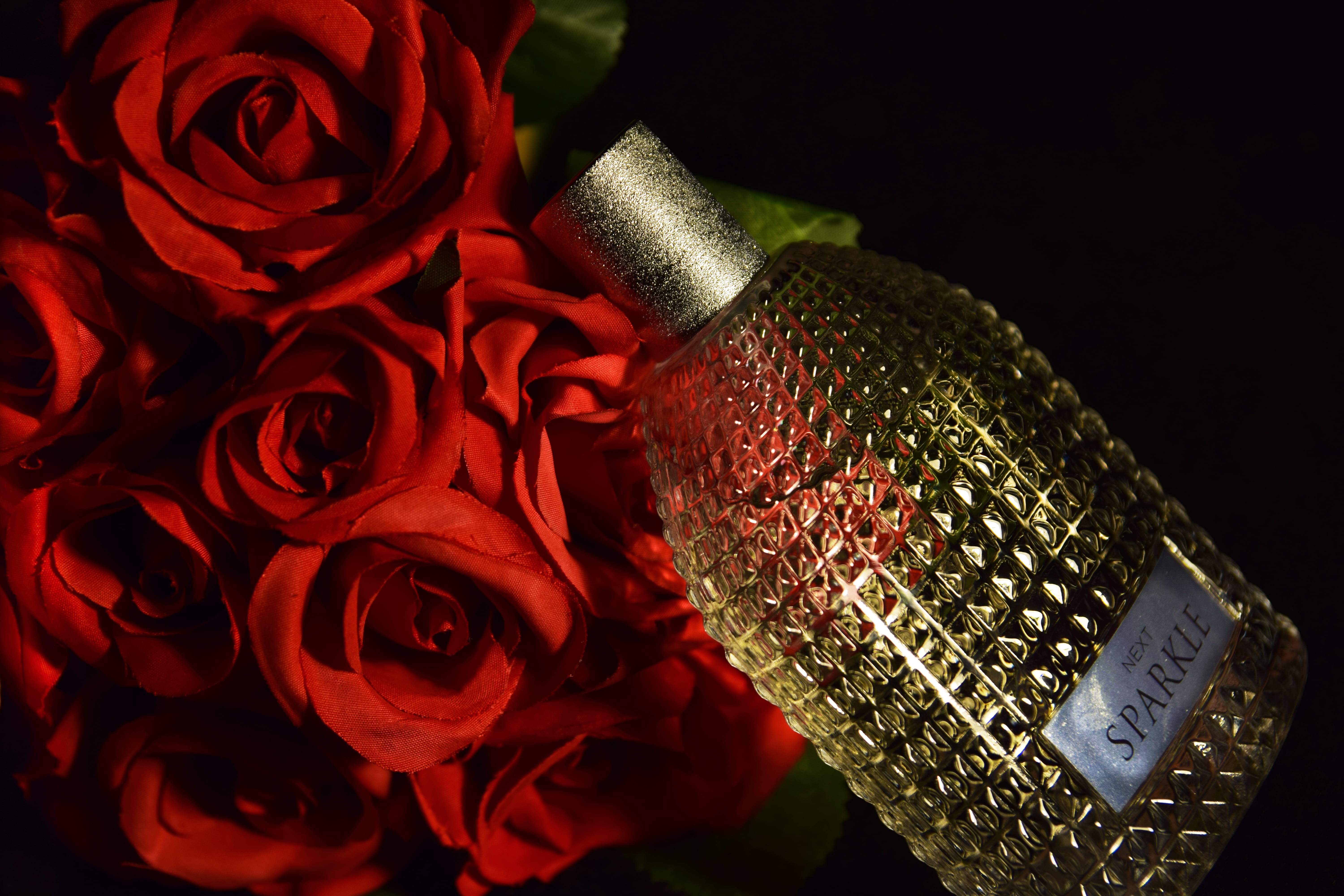
I chose this photograph to be my final image for multiple reasons – including, the lighting, composition, focus and the overall colour of the photograph. In relation to composition, I really liked this photograph because the objects do take up the majority of the photograph, but the background can still be seen slightly in the top right hand corner of the photograph. Also, I like how I made the perfume bottle lean on the flowers as it makes the overall image look more interesting and like the two objects are actually interacting rather than just randomly being placed next to each other. In relation to the lighting that has been used, I think that I have done well with it as the photograph is not too light, but at the same time, it is not too dark either – so the audience can clearly see the objects that are being displayed in the photograph. Moreover, I like the glare that is being shown on the perfume bottle as it is not too bright and makes the photograph more alluring and appealing to look at. Furthermore, the whole of the photograph is in focus which is good as it ensures that the audience know what to pay the most attention to in the image, but also I like the colours that I have used in the image – I did edit the image slightly after I had taken it to make the red from the flowers and the bottle stand out more, but I think this was an advantageous idea as it makes the objects in the photograph stand out more and is more attractive for the audience to look at.