As I have previously already looked into the concept of portraiture during the time in my workshops – I have not actually done that much research on my own to understand more about the concept of portraiture and the different elements that could be included in a portraiture photograph to make it appeal differently towards various audiences. For my own portraiture assessment, I have thought of some ideas and elements that I would like to include in my work. Firstly, I really do like the use of low lighting, so I believe that this will most likely be something that I will incorporate into my final image, but at the same time, I like some of the portrait images that are quite bright and stand out clearly, but most importantly, I like how some portrait images can appear to be a different colour – such as, orange, blue, purple and just general neon colours and I think this would be an interesting element to incorporate into my portraiture work as it is something different to do and will stand out when an audience views it. Even though I would like to use bright neon lights, I can still use low light in these photographs as the lighting I use will just not have to be as bright and will still stand out on a lowly lit backdrop. Due to the fact that these are my initial ideas for my final portrait photograph, I decided to do some research in relation to photographers that incorporate these components into their own photographs to enable me to see how professionals use these elements – which will hopefully influence me and enable me to think of good ways to portray my photographs to my audience. Underneath you will be able to see the different photographers I have done some research into to help me when it comes to my final portraiture photograph.
Lindsay Adler
From looking at all of Adler’s photography work, I can clearly see that she is a make up photographer, which I believe is even more interesting for me due to the fact that I know her work will focus mainly on the face and the make up that the subject is wearing. I found that Adler’s photographs were really appealing and eye catching and I think this may be because of the colours that she uses in her photographs as she generally does not work with any plain colours – such as: black and white, but mainly works in colour – such as: purple, orange, pink. I think that using a range of colours makes the images more intriguing, but simultaneously, due to the fact that the main appeal of her photographs are the make up on the subject, she tends to use coloured gels that correspond with the colour of the make up that the subject may be wearing – which presents that Adler has though about the composition and overall look of her photographs in a lot of detail. Below is one of Adler’s photographs that I think will be influential to my own portraiture work:
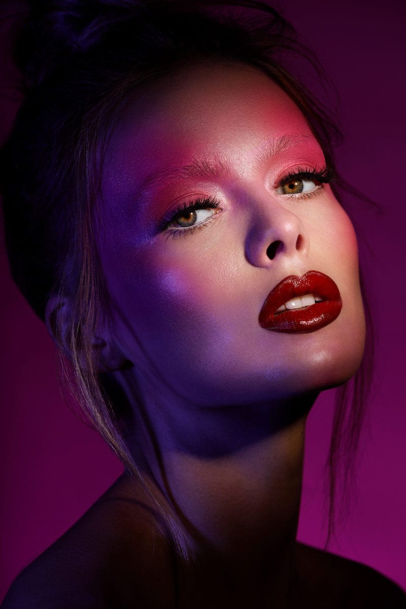
I really liked this image when I first saw it due to the fact that I feel like all of the colours that have been used work well together and are all corresponding with one another. As I said previously, Adler likes to ensure that the colour gels she uses for her photographs correspond with the colour of the make up that the subject in the image is wearing. I think is is really appealing how pink make up has been used on the subjects eyes and then a purple coloured gel has been used, which constructs a neon colour and makes the whole image look pleasant overall, but at the same time, the audience is able to see parts of the subjects face shining – making her stand out more and putting all of the concentration onto the subjects face, which is what is intended as again Adler is a make up photographer. As well as the colour gels that have been used, I am also really intrigued by the lighting that can be seen as I think that low lighting is really appealing. The lighting that has been used in this photograph is beneficial due to the fact that it puts all of the concentrate onto the subjects face as the background of the photograph is quite dark and also the subjects body and top of the head is quite dark, but is still noticeable – while all of the light is on the face of the subject to again show the make up that has been used to the audience – which will hopefully appeal to them and will therefore perhaps make them want to purchase the make up that the subject is wearing. Although Adler does a lot of photography work that contains the use of coloured gels, she does sometimes take photographs that will use either a black or white backdrop and will tend to use a lot of low light – which again, conforms to the type of portrait photography that I would like to construct for my final portraiture assessment. Overall, I think that Adler’s work will be really helpful in influencing me and my portraiture photographs due to the fact that she uses a lot of elements that I would like to include in my own work.
Image Sourced from: https://www.lindsayadlerphotography.com/index
Andreas Jorns
Andreas Jorns is another portrait photographer that I found really interesting because of how he takes his images – he tends to present to the viewer what the subject is really like and that they are just a normal person like anybody else. What I found really appealing about Jorns’ photographs is the lighting that is used and after doing some research I found out that Jorns tends to use Rembrandt lighting, which I do remember being told about during one of our workshops in the photography studio. I decided to do some research into the concept of Rembrandt lighting and realized that it a specific lighting technique that creates a small inverted triangle of light on the subjects eye or cheek that is on the opposite side to the light source and as well as enabling the audience to see both of the subjects eyes in the low light situation, it can also be more appealing for the audience to look at and makes the subject themselves look more flattering. Due to the fact that I would like to do low lighting portrait photographs, I think that Jorns will be beneficial individual for me to do more research into. Below is one of Jorns’ photographs that I think is going to be influential to my own work:
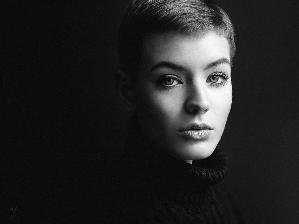
A lot of Jorns’ photographs do look similar to this specific photograph that I have chosen – however, I liked this one the most out of all of them due to the fact that it is something I would like to recreate when I come to constructing my own portraiture photographs. I find this photograph really alluring because of all of the elements that have been included within it – firstly, I like the lighting that has been used because the low and hard lighting makes it look like the subject is essentially hiding in the dark and you are partially able to see part of her face as she wants to stay hidden, but again going back onto the concept of Rembrandt lighting – I like how it has been used in this specific photograph due to the fact that if lighting was not present on the left side of the subjects face, then you would not be able to see her left eye and only half of her face would be present in the light, but by using Rembrandt lighting, not the whole of the subjects face is lit – which would appeal to the audience differently if it was, but it is only lit slightly with a triangle shape – making the overall photograph look more appealing as the audience are able to see that the subject is hiding in the dark, but they are also able to see her facial expression. One thing I noticed when doing some research into Jorns’ work was that he likes to present his photographs in black and white and I believe that this may have something to do with the lighting he is using because the lower the lighting, the less can be seen by the audience – so it may be easier to show the contrasts by making his photographs black and white. Nonetheless, I think the use of the black and white does compliment this specific photograph as it makes the subject stand out more from the backdrop she has been placed in front of. When I come to take my own portrait photographs, I do not think I will have them in black and white – however, this depends on how the photographs turn out and how I would want them to appeal to the audience. All in all, I believe that Jorns will be influential to my own work mainly in relation to the lighting that he uses as this is again the type of low lighting that I would like to incorporate into my own portraiture photographs.
Image Sourced from: https://ajorns.strkng.com/en/
Mike McGee
I also found McGee’s work to be really intriguing because of the colour gels that have been used in his photography to make his photographs have a neon coloured look to them. When looking at McGee’s work, I noticed that he is different to the previous two photographers I have looked at in the sense that he tends to take portrait photographs at full length or to the torso rather than doing close ups of medium shots of the subject and I think that this is an interesting concept to keep in mind as it means that the audience is able to see more of the subject and perhaps understand more about them as they could possibly see where they are located or what they could be wearing. McGee’s work continuously changes over time and he will tend to take a range of different portraiture photographs of everyday people whether he is in a studio or in the outside world somewhere. Here is one of McGee’s photographs that I believe could potentially be beneficial in helping me construct my own portraiture photographs:
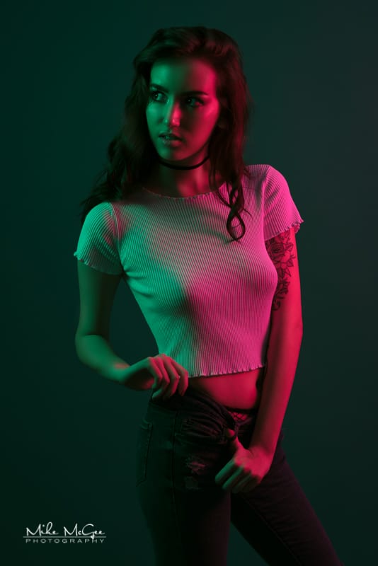
When looking at this photograph, you are able to see that it looks like there is a lot going on and I think this is mainly because of the colour gels that have been used because if these colours had not been used and a plain black or white was used, then the photograph would seem quite bland and boring, but by using different colours – such as: green and purple, the subject stands out a lot more and becomes more appealing for the audience to look at. I believe that the coloured gels that have been used in this photograph are really important due to the fact that they are what makes the subject stand out as the colours are all over her body and because of this, I also think it is one of the reasons McGee decided to take more of a long shot than a close up on the face as it enables the audience to see all of the colours on the subject, but also the pose that the subject is doing makes it look as if she is looking towards the lights as if something interesting is occurring where the lights are coming from. Moreover, the majority of the coloured gels are on the subjects face – which again does draw more attention to her face – ensuring that the audience look at all of the subject rather than just looking at either her body or just her face. The overall lighting that has been used in this photograph is good and appealing to look at as the subject has not been lit too brightly, but at the same time, they are not too dark and have been lit perfectly as you are able to see certain shadows being casted off the subject. If the lighting was too bright, then the photograph would not be as interesting to look at, but because darker lighting has been used, it makes the coloured gels stand out more and put more concentration onto the subject and what she is doing. Overall, I think that McGee’s work will be influential to me and my own portraiture work due to the fact that I like how he has used coloured gels, which is something I would like to include into my own photographs.
Image Sourced from: http://www.mikemcgeephotography.com/
Leave a comment