Project Proposal Form
Which of the words given in the brief document have you selected, and why?
I have decided to concentrate my work around the word ‘Division’. I personally decided to choose this specific word due to the fact that when I think of the term ‘Division’, there are a range of concepts that come to my mind. Due to this, I have decided to revolve my work around this term because I believe I will be able to think of a range of ways that I would be able to represent this term through imagery in my photographs. My main concept is to look at numerous antonyms (ie. love and hate) and express them metaphorically through imagery in my photographs and this will enable viewers to interpret the photographs in their own way, as well there being an original interpretation.
What do you want to point your camera at?
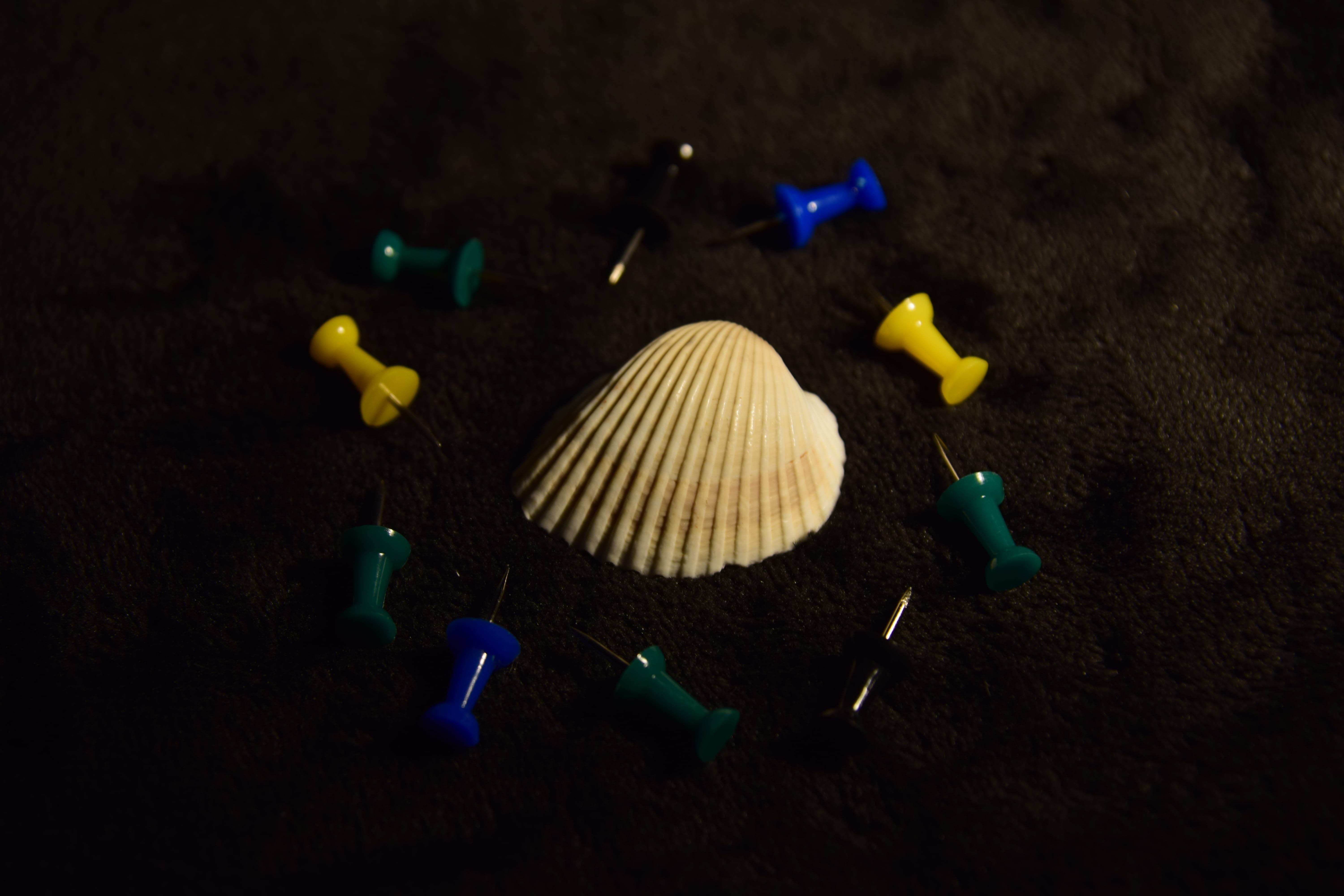
I decided to think intensely into the word ‘Division’ due to the fact that I want to photograph features that would appear metaphorical to the viewer rather than making it obvious – therefore, the imagery will more likely be subjective than objective as the viewer will be able to examine and understand my photographs in their own way. Due to the fact that I have decided to use metaphorical imagery, I will use elements such as: flowers, board pins, mugs, knives, cards and water bottles. I will essentially be using objects that I have around my apartment, but will also leave my apartment and find some objects from nature that I could possibly use. Nonetheless, I will be able to use a range of various objects to express my ideas towards the viewer of my photographs.
Why are you interested in this subject?
I am mainly interested in the concept of ‘Division’ due to the fact that it can be interpreted in so many ways as there are so many different types of division depending on how the viewer may be looking at it. In terms of the antonyms concept I am going with, I am interested in this quite a bit as I will be able to look at the division between various words and then will be able to represent how they are so diverse to each other through my imagery – but as I said before, I will be doing this metaphorically, so I will be using specific features – for example, flowers and knives to represent the antonyms love and hate and hopefully this will have a greater impact on the viewer as they will be able to think more into the imagery that has been used and what it may represent. Overall, I just feel like this is all an interesting subject and that it will be enjoyable to construct.
What do you hope an audience will take from your images?
Due to the fact that I want these image to be subjective, I will enable the audience to take away what they want from my photographs as they will interpret and view the images in their own way. I hopefully would like to portray a deeper meaning towards the audience so they would understand how certain feelings or actions are felt by other individuals, but also to enable individuals to understand and interpret certain features in their own way. I mainly would like the audience to think about the objects I will be photographing differently and essentially understand them in a deeper meaning to see how these certain features could be used to represent certain words and emotions.
What areas of research are you considering to help deepen your understanding of the subject you have chosen?
As I have not started much research yet, I am not completely familiar with I will be looking at in more detail and how this research will help my final products. However, once I start doing more research I will know more about how I will be portraying my photographs and how I will want particular objects to be laid out in the photographs. When thinking about my work, I believe that I will be sticking to the style of conceptual/fine art photography as this genre enables me to express emotion and feelings through my photographs and the objects within them to enable the audience to have a greater understanding of particular meanings behind certain words. As I develop throughout this semester, I will be doing more research to help me understand the meaning and roles of photography to hopefully influence and improve my photography skills.
What practitioner(s) or visual resources would you consider to have influenced you? This does not have to be photographic.
As I said previously, I have not done that much research yet, so I am not completely certain on what work I will be looking at to help influence me. Nonetheless, there are some artists that I have looked at so far that have potentially influenced me and this includes: Irving Penn – who has presented fruit in various ways in his photography, Dave Nitsche – who mainly looks at division in his work, but also I have looked at the work of Josh Caudwell – who mainly photographs in relation to make up, which is one of the objects I could potentially use in some of my photographs. Other than looking at existing photographers, I could look at other work in different mediums, such as paintings and various concept art – however, I will be looking into all of this in more detail when I begin to do more research into the topic I have decided to do.
What support or equipment might you need to achieve your goals?
Even though I can use the equipment from media loans, I have decided that I will be using my own equipment to take my photographs on. Firstly, I will be using a DSLR camera and the one I have decided to use is a Nikon D5300 camera – this will be used to shoot all of my practice and final photographs. I also have two different lenses I could possibly change from – a standard 18mm to 55mm lens and a more focal length 17mm to 50 mm lens, which will enable me to get more interesting shots. As well as the camera, I will be using a tripod to ensure that my camera is stable and that all of my shots are straight when they need to be. I will also use external lighting to ensure that my photographs turn out the way that I want them to be and that the composition of the photographs are up to standard. As well as all of the camera equipment, I will also need to ensure that I have all of the objects I need for my photographs and any backdrops I may want to possibly use to make my images more interesting and appealing to the audience. When it comes to actually taking my photographs, I may possibly need some support from other individuals when it comes to lighting to ensure that I make sure it is coming from the right angle and that my photographs turn out the way I want them to look. Nonetheless, I will most likely ask other individuals to help me to either use objects they own or to ask them to help with lighting or setting up when it comes to taking my photographs.
Photographer Research
As I am new to the concept of photography and everything that is involved in it, I knew that I would have to undertake a lot of research to ensure that I gain some influences for my own work, but at the same time, it would enable me to understand how photography works in more detail and what elements within photography are the most important. Underneath you will be able to see that I have undertaken some research in relation to existing photographers work, which I believe will be influential to my own work as they have used elements that I would like to include in my own work or they have just made some interesting work that I wanted to look at in more detail.
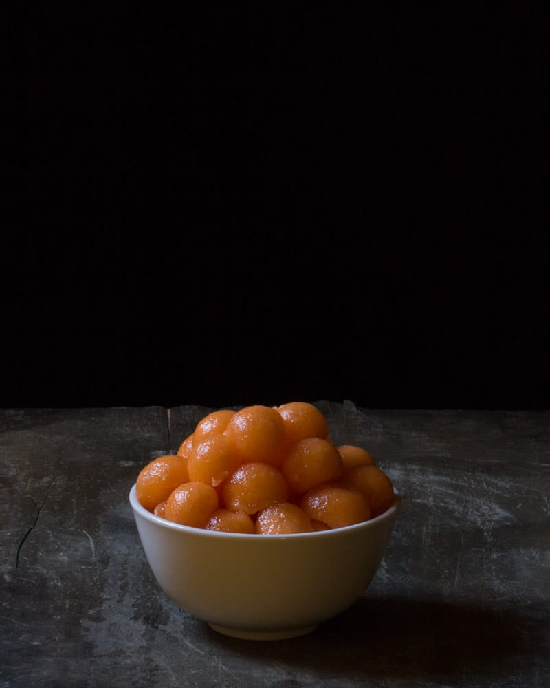
Irving Penn
One of the first photographers I knew I would look at for inspiration was Irving Penn – the first time I saw his work was during one of my photography workshops as our tutor was showing us various types of still life photography that we could perhaps look at in more detail to gain inspiration for our own still life work, or even just for our final project. Penn was an American photographer, who mainly worked with fashion, still life and portrait photography. When doing more research into Penn I noticed that he does undertake a diverse range of photography, which I found really interesting – however, I decided to keep looking at specific images I thought would be influential to my own work rather than looking at all of the different styles of photography he had done.
Here are some of Penn’s images that I found influential to me:
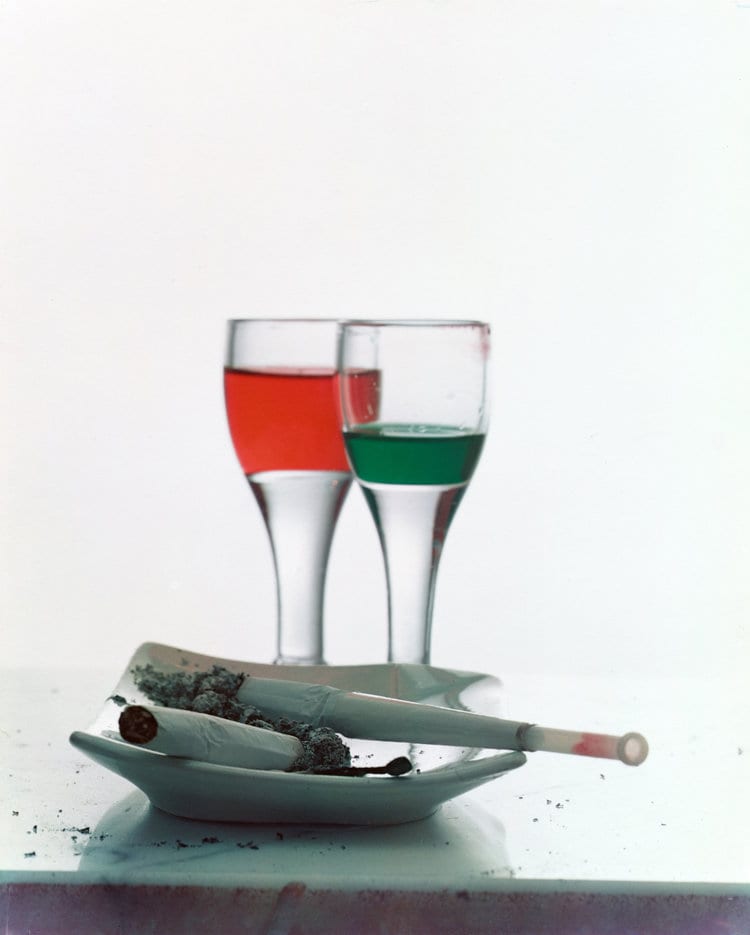
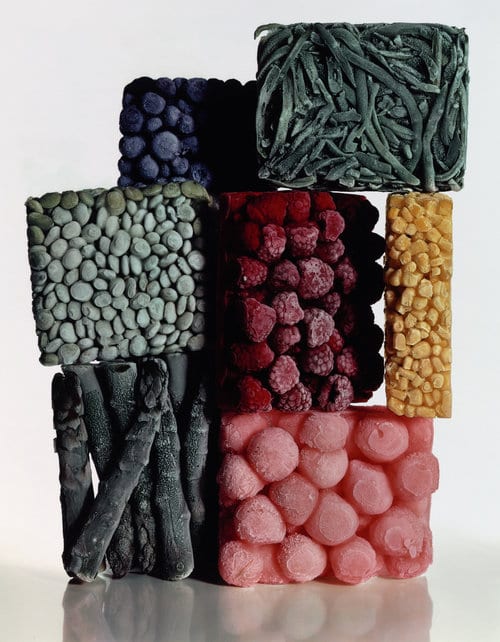
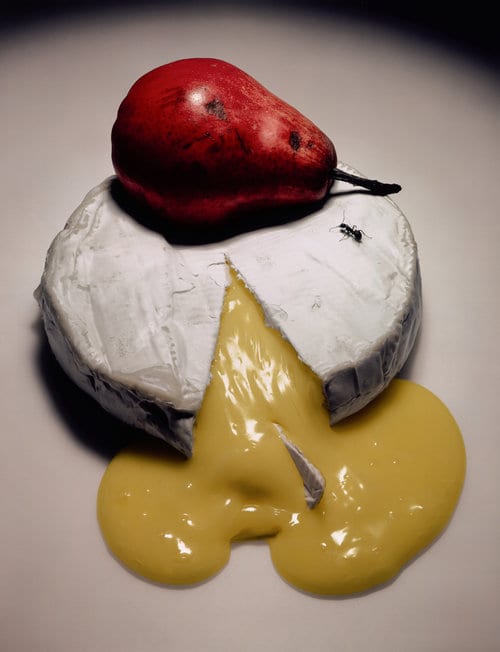
If these images are viewed at a glance then everyone would most likely have the same objective view that they are all different images and have nothing in common – however, there is a subjective side to these images due to the fact that if the audience looks at them in more detail they will see that they all have a deeper meaning and do actually link in some way. I believe that these images are really influential to me and my work because I want to construct metaphorical images that have a deeper meaning when the audience looks at the images more deeply – for example, in the ‘Frozen Food With String Beans’ photograph, the subjective view that I take from that image is again metaphorical and is kind of like people appear to be in clumps of groups and that they stick to their own social groups that they are used to when they appear in public andthey may be surrounded by other social groups that they are not used to socializing with, which is why all of he fruit does not fit together perfectly as these social groups do not get along. As well as these images conforming to my concept of using metaphorical imagery, they also conform to my chosen term of ‘Division’ – for example, in the ‘Two Liqueurs’ photograph the viewer is able to see the division between the two drinks – mainly because of the use of colours, but also in the ‘Ripe Cheese’ photograph you are able to understand the difference between both the pear and the cheese. Moreover, I like all of these images in their own way – including all of the objects that have been used, the lighting, composition, and even the angles the photographs have been taken at and I believe that they have had some type of impact on me in relation to what I would like to include in my photographs and how I would like them to be presented. Overall, I think that Irving Penn is a great photographer and that a lot of his work has helped in influencing me and enabling me to see how I should portray my own work to an audience.
Images Sourced from: https://www.irvingpenn.org/still-life
Dave Nitsche
Nitsche was a photography that I found from undertaking my own research and I found his work quite intriguing and different due to the fact that he uses imagery that would seem distinct to anyone who may view his work with an objective approach – however, for the people who may view his work with a subjective approach will understand that his work seems to have a deeper meaning behind it all and that there is a lot more going on than the viewer may think, which is why I like his work as this is the type of approach I would like to go with when it come to my work. Due to the fact that I found such an interest in Nitsche’s work, I decided to look at more of his photography work – however, again there were some images that I did not find as interesting as others as they did not conform as much to the work that I would like to produce.
Here is some of Nitsche’s work that I found influential:
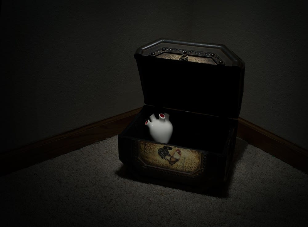
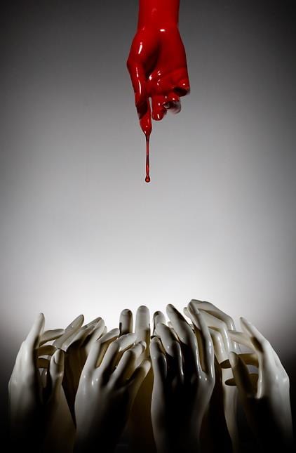
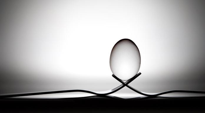
As I said previously, Nitsche’s work is a lot darker and diverse compared to other photographers I have looked at – however, the way he presents his photographs and uses objects is similar to the way that I would like to express mine to an audience. Firstly, in relation to my concept of constructing metaphorical and subjective photographs, I feel like these images are helping me in thinking of some ideas I could possibly use for my photographs – for example, in the ‘Forgotten’ photograph, the audience is clearly able to understand that the meaning behind this image is that it is about being left alone and ‘forgotten’ as the heart has been left in a chest and even though the chest is open, the viewers are still able to see that the heart is lonely – this is also reinforced through the use of colours as the majority of the photograph is either black or dark, while the heart stands out as it is in white. Furthermore, you are also able to see that a lot of Nitsche’s photographs conform to the concept of ‘Division’ as in the ‘Salvation’ photograph the use of the colours red and white are extremely important as they express the separation of the different hands as one may appear to be more dominant than the other. Also, in the ‘Cradle’ photograph, I understand this image in the sense that the egg needs two different sources to keep it alive – which presents that although the two forks that are keeping the egg balanced could possibly break the egg, it is still relying on the forks to keep it balanced and alive, which I feel is really compelling. On top of that, I like all of these images for many reasons, but I think the most intriguing feature is the use of colour that has been used as it enables the viewer to concentrate on one specific thing in the photograph and help them to understand the meaning behind the image. As well as this, I think the lighting that has been used compliments the colours that have been used because if bright lighting had been used then the photographs would not have the same appeal and I personally think would not look as meaningful or interesting to look at. Overall, I believe that Dave Nitsche will be an extremely influential artist for me when it comes to me constructing my work as his photographs are very diverse, deep and meaningful – which again is something that I would like to do in my work through my metaphorical imagery.
Images sources from: https://www.davenitsche.com/Galleries/New/1/thumbs-caption
Andre Kertesz
Kertesz was actually introduced to me in one of our photography lectures and when I first saw his work I thought that it was quite simple and dull in a way from the photographs I was shown in the lecture – however, after doing some more research, I actually noticed that some of his photographs are quite interesting to look at. In relation to the other photographers I have looked at so far, I would say that Kertesz is not as diverse and outgoing with his photography as others are – however, he still creates meaningful photographs that are alluring to look at. Furthermore, all of the photographs that Kertesz takes are different, so I mainly looked at his still life work as this is mainly the type of thing that I will be doing for my own work.
Here are some of Kertesz’s photographs that I think will be influential to me:
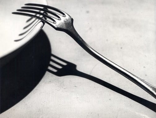
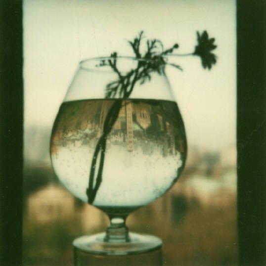
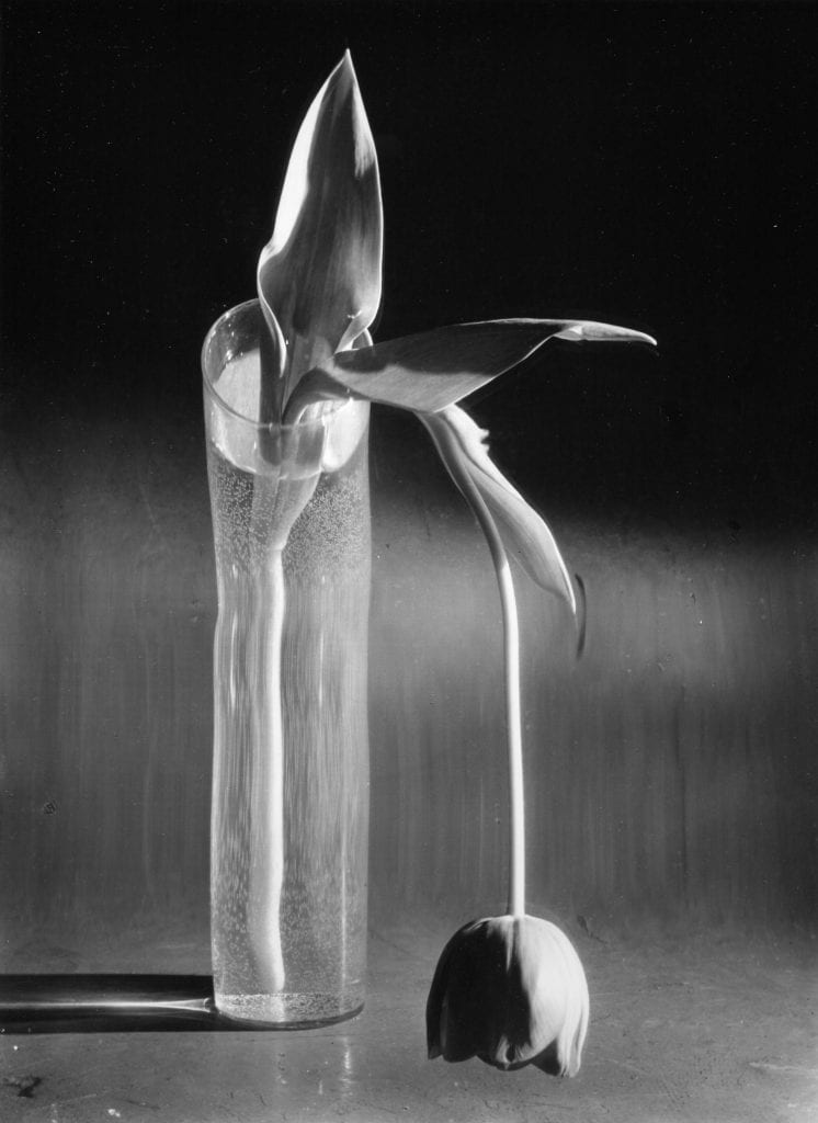
When actually looking at Kertesz’s work, you are able to see that no two photographs of his are similar and that every photograph he has taken has a different meaning. In relation to my initial ideas for my photographs, you are able to see that some of Kertesz’s photographs use the concept of metaphorical imagery and relates to the term ‘Division’. For example, in the ‘Melancholic Tulip’ photograph, the viewer is able to see that the tulip itself essentially represents sadness or depression and even though it is in water and is being kept alive, it still does not actually feel alive and this also represents the division between life and death or even happiness and sadness. Moreover, the concept of ‘Division’ can also been seen in the other two photographs – for example, in ‘Fork’ the main division can be seen between the actual fork and then the shadow of the fork and then in the ‘May 3’ photograph, the division can be seen between the city in the background of the image where a shallow depth of field has been used and the city that appears to be upside down in the glass that contains the flower. I personally like the ‘May 3’ photograph the most out of all three of these photographs as the upside down reflection of the city makes me feel as if this is an alternate version of the city and that there will be something different occurring there than in the original city that is facing the correct way up, so it gets me thinking more about the image overall and how it is being portrayed towards the audience. All in all, I do not think Kertesz will influence me as much as the other photographers that I have looked at – however, I believe that some of the elements he has used are intriguing and are something I could possibly think about when it comes to constructing my photographs.
Images sourced from: http://www.artnet.com/artists/andr%C3%A9-kert%C3%A9sz/3
Catherine Vibert
When doing research in relation to photographers who tend to photograph any object they can get a hold of, I came across Catherine Vibert and found that her work was quite interesting. Again, she is the type of photographer that will take images of various things and will not stick to one type of photography genre. However, due to the fact that the majority of my work is going to be still life, I decided that I was just going to look at Vibert’s still life photographs in more detail instead of looking at all of the various types of photographs that she has taken. I feel like Vibert’s work will be really influential on my work and will enable me to think of good concept and elements that I could potentially include within it.
Here is some of Vibert’s work that I found would be influential to my own work:
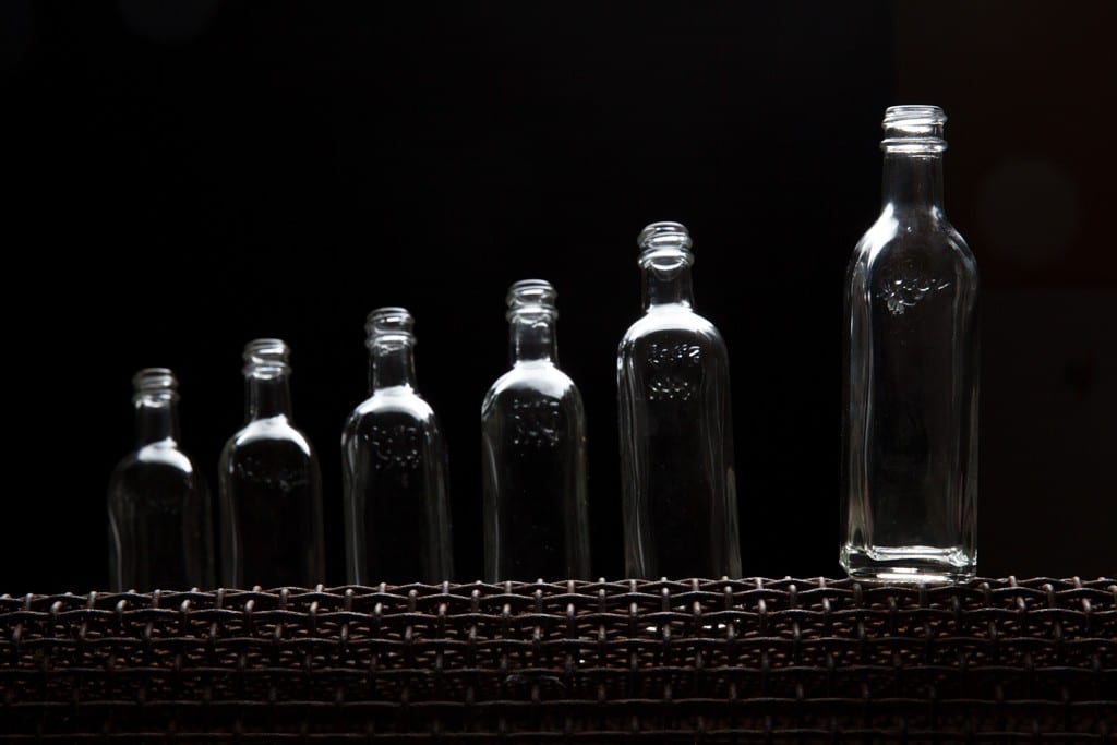
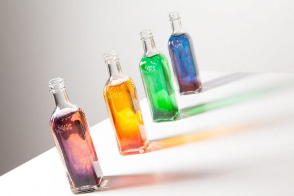
The majority of Vibert’s still life photography is similar in a way as they all include similar features and elements to convey a particular message to the audience. Again, when looking at Vibert’s work, I felt like she included features in her work that I could possibly use and I feel like some of her photographs could relate to the concept I am going with for my project – for example, I feel like both the first and second image could have metaphorical meanings behind them as the first image could be about dominance and how some people have more power than others and the second image could potentially be about feeling insecure and hiding away from others and not expressing yourself. On top of that, I also feel like Vibert conforms to the concept of ‘Division’ as this can clearly be seen in the last image through the use of colour as all of the bottles contain different liquids – meaning they are all diverse and metaphorically have their own personality. Also, division can be seen in the very first photograph as all of the bottles are different sizes, so they are all unique in their own way and will each be seen differently by various people. Overall, I feel like Vibert’s work will be really influential to me due to the fact that I like how she can use the same object multiple times, but they all appear differently – which presents a stronger meaning of division as it demonstrates that although something may be the same, it does not mean that they will all have the same features and will do the same thing as they are all unique in their own way.
Images sourced from: http://catherinevibert.com/things/
Initial Idea
Since I have already undertaken some research, I now have a greater concept on what I would like to do for my final individual project – I have briefly gone through what my idea is in my individual proposal – however, I will now go into more detail about it. Firstly, I have chosen to work with the word ‘Division’ and google can define this word in two way – one which is “the action of separating something into parts or the process of being separated ” and the other explanation is: “the difference or disagreement between two or more groups, typically producing tension”. By looking at these definitions, I can see that I will mainly be conforming to the second definition due to the fact that my photographs are going to include imagery that are supposed to be oppose from each other – however, I will also be conforming to the first definition due to the fact that the elements I will be including in my photographs will be separate from each other, in the sense that they can be differentiated from one another.
To go into more detail about my concept for my independent work, I have decided that I will be looking at different antonyms and will represent these through different pieces of imagery, so two words will be represented in one image – for example, one of the antonyms I have decided to work with is ‘love and hate’, so when it comes to taking a photograph related to these words I will be using flowers to represent the concept of love and knives to represent the concept of hate in my photograph. By doing this, my photographs will have more of a deeper and metaphorical subjective meaning which the audience will have to think about it more detail – meaning, they will be looking at my photographs for a longer amount of time and therefore will be able to consider them more. As well as this, I feel that by using a metaphorical meaning, my images will become more subjective than objective as the viewer will be able to interpret the image in their own way and have their own understanding from the elements that will be included in my photographs. Some of the antonyms that I have considered doing for my photographs include:
- Love and Hate
- Black and White
- Confident and Shy
- Crazy and Sane
- Noisy and Quiet
- Anxiety and Calm
- Happy and Sad
- Create and Destroy
- Strong and Weak
- Life and Death
My main idea for my project is to use normal everyday items that you would see or even that any normal person would own – including: a water bottle, egg cup, knife, stapler, screwdriver, playing cards, cables and even just paper. I decided that I would like to use everyday items due to the fact that I feel like they would help more in getting an emotion across to the audience and helping them understand what I may want to be occurring in some of the photographs I will be constructing. Furthermore, I feel as if the concept of division can be represented in various ways when it comes to photography as a range of imagery or elements can be used and put together to conform to the theme of division. After doing more research in relation to existing photographers and finally figuring out what I will be doing for my independent project, I decided that I wanted to take some images of items in my bedroom that I could possibly use in my final photographs and by taking these images I was able to get a greater understanding of how I should position certain objects and whether I should use them in my final photographs or not.
Here are the images I took in my bedroom:
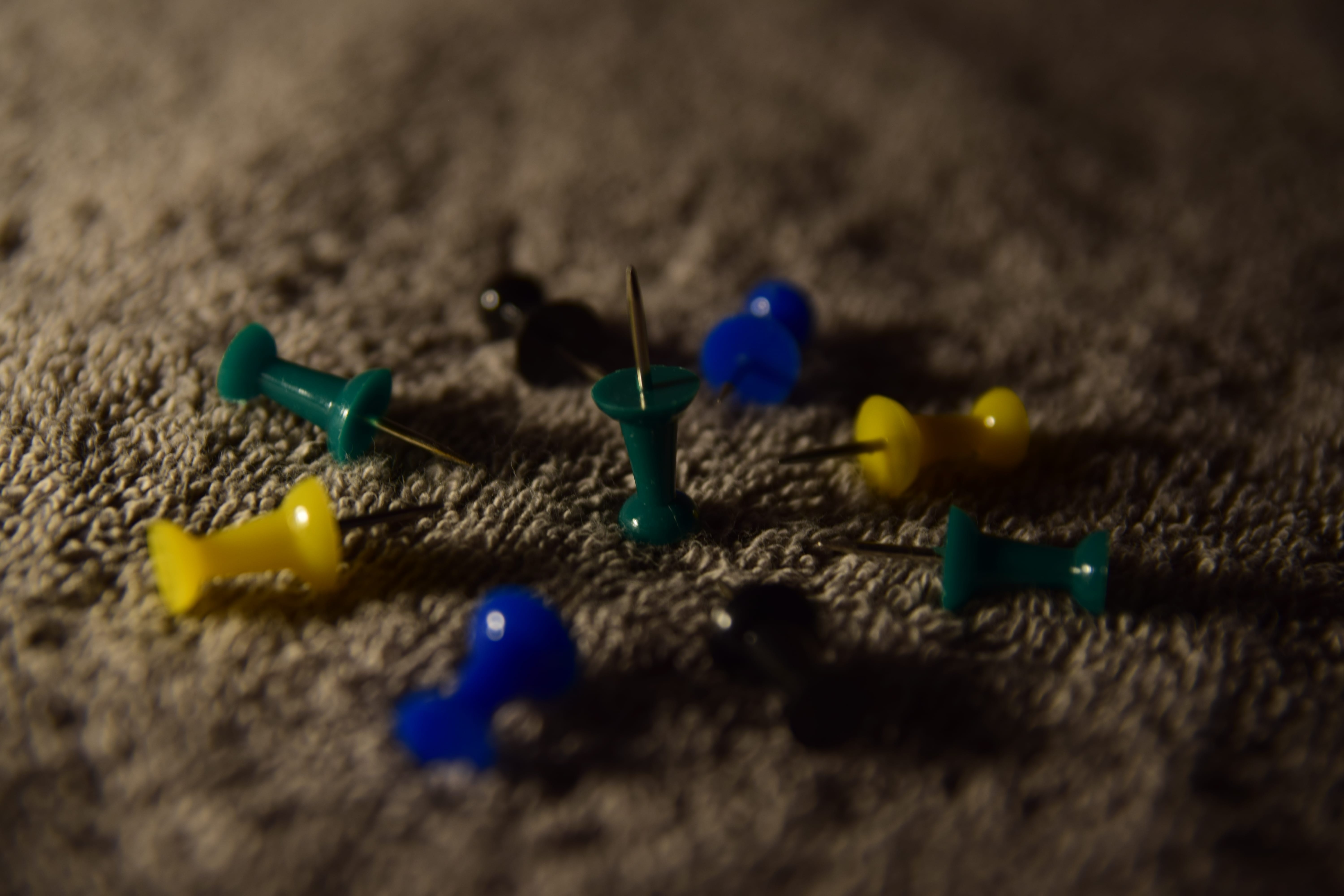
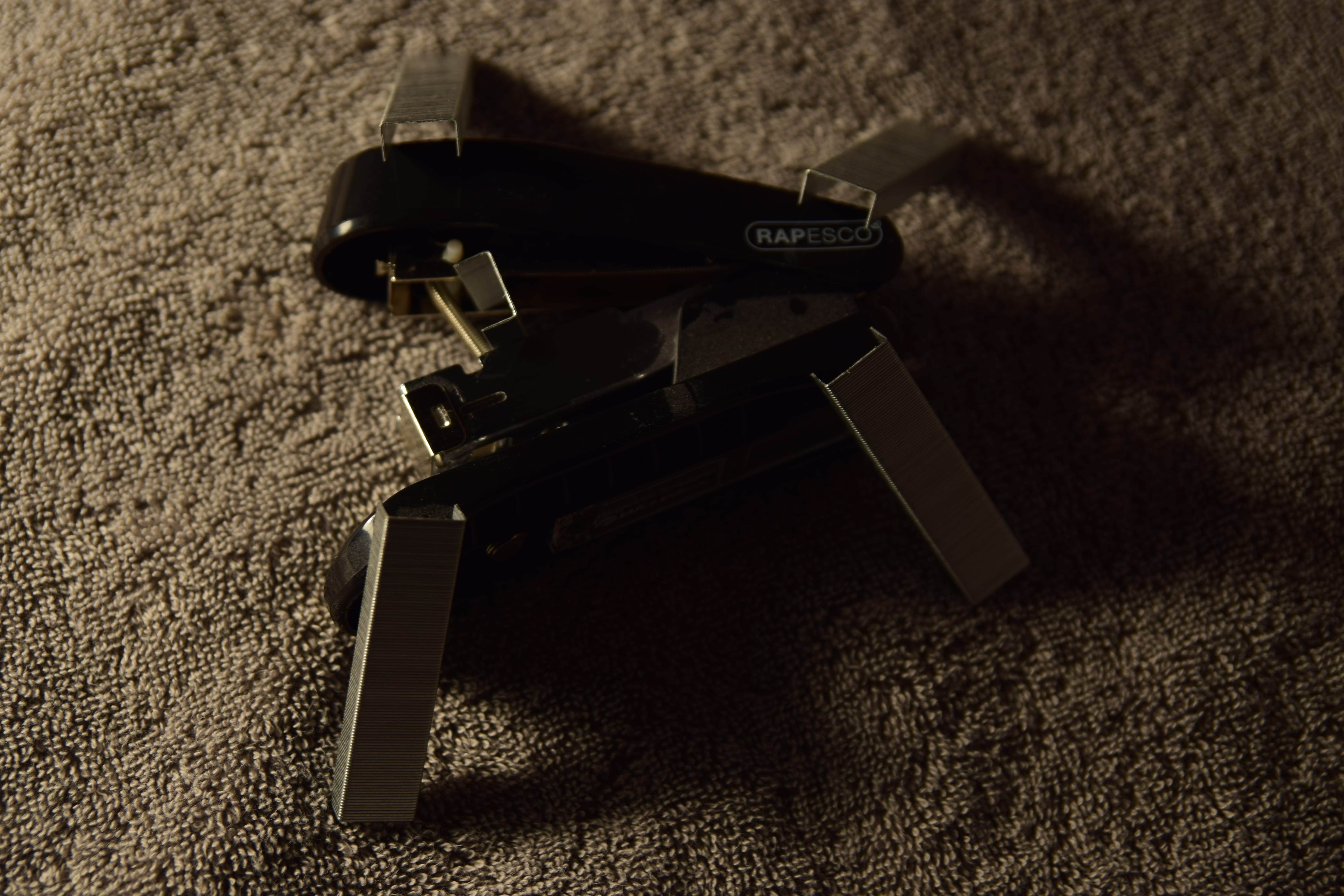
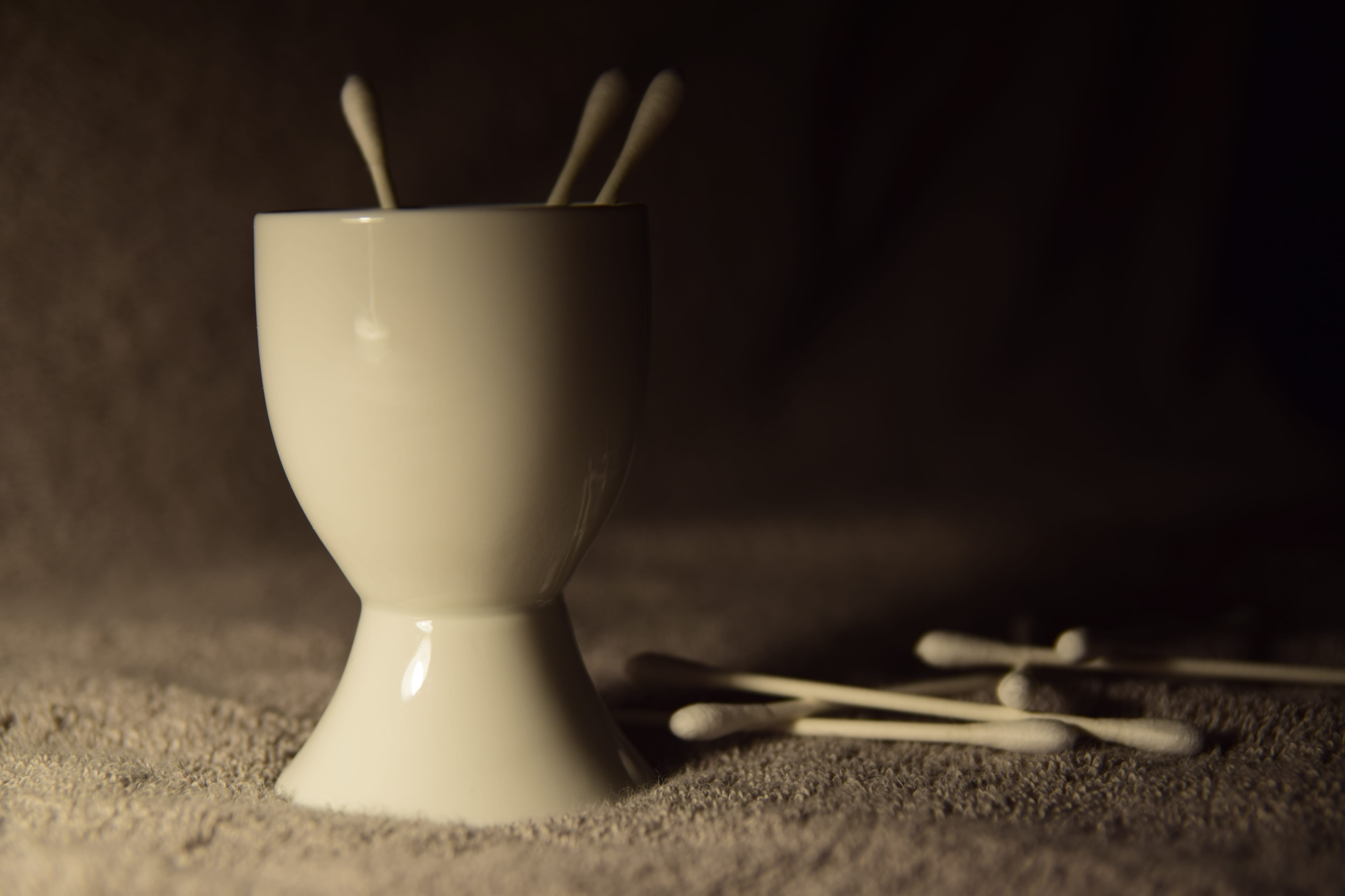
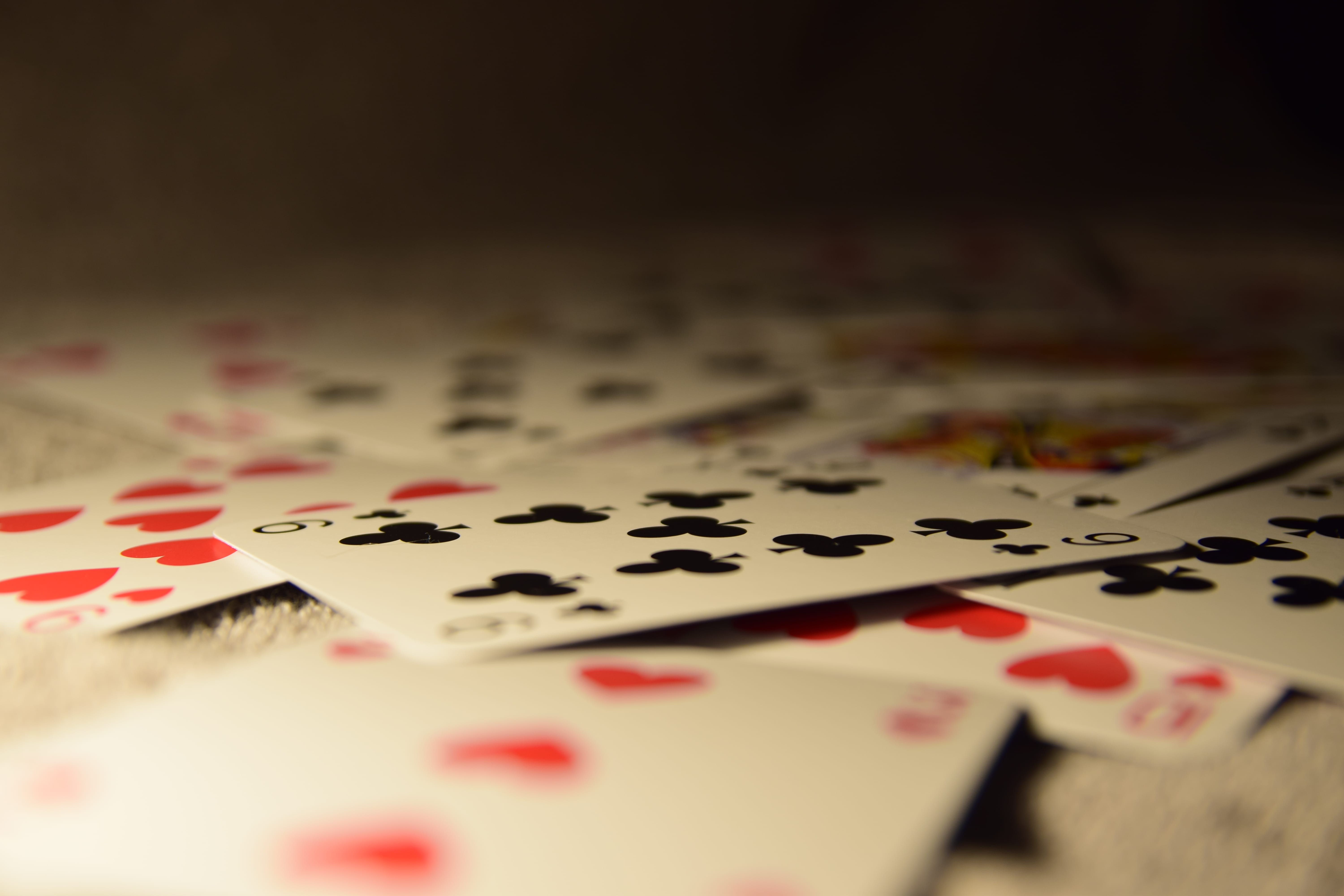
When looking at these images I have taken, you are able to see that they are not perfect and that there are some issues in relation to either lighting, composition or placement – however, I wanted to take these images to make me think more about what objects I could possibly include in my photographs and how I will need to lay the out to make them look interesting and to ensure that they appeal to the viewer. I believe that the objects I have used can be seen as meaningful in a metaphorical way – however, when it comes to taking my final photographs, I will be including more than one object in the photographs as again I am using imagery in relation to particular antonyms, so I will need to choose objects that contradict each other to ensure that I get the meaning I wanted to create across to the audience. Out of all of these images, I would probably say that my favourite is either the second photograph of the stapler and the staples or the first photograph of the egg cup – I think this mainly due to the fact that I like the lighting that I have used, but I also think the placement on the objects in the photographs are interesting and would be intriguing for the audience to look at. Overall, I think it was beneficial that I decided to take some practice photos to ensure that I knew what I was doing for my final project and that I was certain I want to do it, but also by doing this I think I have learnt more about how photographs should be presented towards the audience and how they may interpret certain work with a subjective approach.
Further Research
As I have already done research in relation to photographers that will hopefully help me when it comes to constructing my photographs, I have decided to do some further research in relation to mediums other than photography which could possibly influence me and my work, but also I have looked at photographers which I think have done very interesting work, but their work would not influence me as it would not conform to the concept for my project. I feel like by doing external research outside of photography will enable me to broaden my ideas when it comes to presenting certain things in my photographs, but also what type of things could possibly be included to make the photographs more interesting and appealing for the audience to look at.
Neck Deep – In Bloom
When I first thought about my photographs for my final piece, I personally did not think that I would be looking at any music videos due to the fact that I felt they had no resemblance to photography – however, I then thought about them more deeply and realized that they could actually be quite influential to me. ‘Neck Deep’ are a Welsh Pop Punk band who generally do conform to the codes and conventions of the Pop Punk genre – however, in the music video for ‘In Bloom’ they seem to challenge the codes and conventions and I think this is why I find the music video so influential to my work.
Here is the music video for ‘In Bloom’:
After watching this music video, you are able to see that a range of elements are used which make the video so aesthetically pleasing to look at – which is what will attract the audience. There is a range of different imagery that has been used throughout the music video – including: flowers, puzzle pieces, a burger phone, doughnuts, a cactus with marshmallows, paint, coconuts and a snail. All of these objects seem quite obscure – however, they all come together to get a certain meaning across to the audience, but the audience is able to interpret this meaning in anyway they want as they video is quite subjective. Again, for my photography work, I want to include metaphorical imagery that will enable audiences to think more deeply about why they have been used and what meaning they have behind them, but again, I want the audience to have their own subjective view on the elements that will be used in my photographs because I want them to be able to interpret the photographs in their own way. Moreover, you are able to see that some of the imagery that is shown in this music video is contrasted with some other imagery – for example, the flowers are drowned in paint and this essentially conforms to my concept of antonyms that I will be doing for my final project as two contrasting elements have come together at once for the audience to see. On top of that, in this music video the backdrops that have been used often changes, but will always stay a bright colour, I think this is a good idea when it comes to photography – however, due to the fact that I want to convey a deep and dark meaning towards my audience through my photographs, I have decided that I will be using a dark backdrop as I believe that it conforms more to my idea and will make more sense to the audience when they see the photographs. Overall, I think this music video has been very influential to me and has enabled me to see what elements I could possibly use in my photographs and again how they could be portrayed towards the audience.
Video Sourced from: https://www.youtube.com/watch?v=RPzf_4dcL28
Marcel Christ
When I first saw Christ’s photography work, I found it really interesting and knew I would be able to use some of the elements he uses in my own work – however, a lot of his photography is something I am not looking at doing, which is why I did not look at him in more detail when I was researching other photographers I have previously looked at. Christ likes to be abstract with his work and tends to photograph broken elements – such as: a broken perfume bottle, which I find really interesting due to the fact that as I want my photographs to be deep and metaphorical, one of my photographs could be about the antonyms ‘strong and weak’ and I could possibly represent the concept of weak through a broken object to enable the audience to gain a greater understand of my photographs and what meaning I may be trying to get across to them. Nonetheless, I think some of the elements that Christ has used will be influential to my own work.
Here are some of Christ’s photographs that I think will be influential to me:
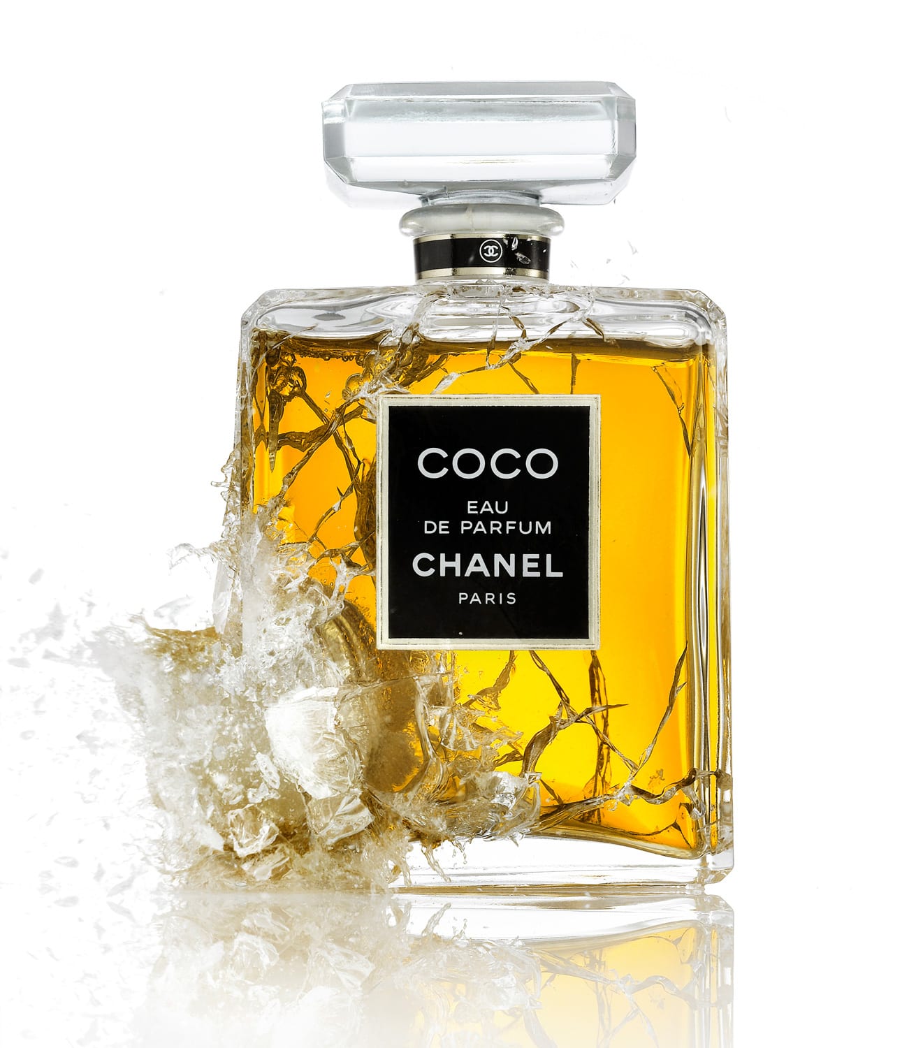

As I said previously, Christ’s work is not the type of thing that I would like to do for my own independent project – however, he does include elements in his photographs that I think are quite interesting and that I could use in my own photographs. I really like the ‘Chanel’ photograph that Christ has taken mainly because of how it has been presented as it has been broken and smashed which challenges the conventions of beauty and appearance, which I think is an interesting feature that has been put across to the audience. Moreover, as I said before, I could use the concept of a broken object in my own photography work as it could possibly represent one of the antonyms I will decide to use. In the ‘Chanel’ photograph, I like the lighting that has been used as the bright white background ensures that the perfume bottle itself stands out and that the audience will put all of their attention on it, but also the composition in the photograph is good as the perfume bottle takes up the majority of the image – however, there is still some white space on the sides and there is also a slight reflection of the bottle at the bottom of the image. I like the ‘Holland’ photograph by Christ because of all of the different elements that have been included in the photograph and they are all so diverse from each other, but he has still photographed them all together – again this relates to my concept for my photographs in relation to the antonyms I will be constructing as I will be using objects that are diverse from each other, but will be putting them in the same photograph together to show how they do contrast. Furthermore, the colour scheme in this photograph seems quite simple – however, it does work as the surface the objects are on is white and the backdrop is grey – which is quite a bland and simple colour, while the objects that are on the table are all black (except the umbrella), so they do stand out and can easily be seen. Also, I believe the lighting that has been used is good as it is not too light or too dark, but at the same time you are able to see that shadows of some of the objects that are in the air which does make the photograph more appealing to look at. Overall, I think some of the elements that Christ has used in his photographs will be influential to me and my work – however, I do not think his photographs as a whole will influence me due to the fact that they do not conform to the type of photography that I would like to do for my independent project.
Images Sourced from: http://www.marcelchrist.com/
Relevant Quotations
Due to the fact that I have already established and finalised my final concept for my independent project, I am able to look more closely in relation to how writers (specifically writers in relation to photography) look at the overall concept of photography and what impact it may have on viewers and even the photographer themselves. As previously stated, my final independent project conforms to the phrase ‘Division’ in which I will be presenting various still life objects in my photographs which will metaphorically relate to antonyms I have chosen to express to the viewer. Due to the fact that I selected the ‘Division’ theme, I decided to look at Miriou’s paper ‘The Selfies: Social Identities In The Digital Age’ which was the week 6 reading for our photography module. I have decided to take two quotations from this paper due to the fact that I believe they both express the differentiation and contrast between particular people, objects and feelings, which I believe links in well with my final photographs and how I want to portray them towards a viewer.
Here is the first quotation I have selected from Miriou herself:
“As the viewer (the photographer) has become the same with the viewed (the subject of the photograph) anew – constructed subjectivity comes into play, and the individual can choose how to construct and publicly disseminate his/her personal identity”
(Miriou, Crisia, 2014: 2)
This quotation is essentially stating that both the photographer and whatever appears in the photograph is one single thing as they link together – which is essentially what is occurring in relation to my final independent work. For example, one of my final photographs conforms to the antonyms of ‘Calm and Anxiety’ and in relation to this quotation, it means that these are possibly the feeling that the photographer is feeling – however, they would not be feeling them at the same time due to the fact that they are antonyms and contrast with each other. Nonetheless, it expresses that a photographer will often photograph their feelings or emotions and will present them to other people where they will perhaps understand the initial meaning behind the photograph or they will be able to interpret the photograph in their own way. Overall, I feel like this quotation relates heavily to my final independent project due to the fact that it expresses to the viewers that what I have been feeling or have previously felt has been expressed through these different pieces of imagery to get a message across to the audience, but simultaneously, it could perhaps express that I want people to understand how these contrasting elements may have an impact on people and that I would want audiences to understand these impacts.
Here is the second quotation I have selected from William James in relation to the ‘Seminal Theory’:
“a man has as many social selves as there are individuals who recognize him and carry an image of him in their mind”
(James, William, 1950: 294 – 295)
This quotation is similar to the first one I have looked at in the sense that it expresses that certain things will link together so an audience will be able to understand what is occurring. This quotations mainly states that an individual will portray themselves differently to fit into various social situations depending on the people they are surrounded by and how they may be acting towards them. I believe that this quotation has relevance to my final independent project due to the fact that I have used the concept of antonyms – meaning, each word contrasts with each other and therefore will have to act differently with each other due to the fact that they are so diverse. For example, one of the antonyms I have decided to use for my final independent project is ‘Love and Hate’ – in a realistic situation, someone would act differently around someone they love than with someone they hate, but simultaneously, an individual will love and hate various people for numerous reasons due to the fact that they have their own ideologies as no two people will think or act exactly the same way – which is why the quotations states that one individual will have more social selves than there are people in the world as a particular individual will act differently with every single person, but they will also act differently when on their own. All in all, I believe that this quotation is relevant in relation to my final independent project due to the fact that the imagery I will be including in my photographs express how individuals can have various feelings and emotions and how they may contrast with other peoples emotions and how that particular individual will then act once seeing another persons persona.
Development/Alterations
During my groups week 10 workshop, we were all individually able to talk to our tutor about our ideas for our final independent project, our blog overall and any concerns or queries we may have with the project. I found that this one to one time that I had with my tutor was very helpful as it enabled me to see what could be changed within my work and also what my tutor thought about my concept for my independent project. After discussing that I was doing my work in relation to the word ‘Division’ and how I was working with the concept of antonyms – my tutor said that it was a good concept and that I was challenging myself by using metaphorical imagery and symbolism – however, he also said that I need to be careful with the symbolism that I used due to the fact that people will interpret it in various ways. Nonetheless, I think this is an advantage due to the fact that I want my work to be subjective and to enable the viewer to understand it in any way that they want to, even though there is an initial meaning that I am trying to portray towards the audience. Before having this conversation, I had already taken some photographs for my final project and from my tutors advice, I can see that I will probably take some more photographs to conform to the advice that I have been given. When talking, my tutor said that due to the fact that I have chosen to work with the ‘Division’ theme, I should perhaps think more about doing a type of ‘split screen’ in my photographs where one object will be on one side of the frame and the other object on the other side of the screen to present the division and contrast – which again makes sense as it enables the audience to understand how the objects are diverse and will make it easier for the audience to comprehend. Moreover, my tutor also said that I should be careful not to be too cliché when it comes to the imagery that I use in my photographs as I will want to make the work my own and not construct something that everyone has already seen before – but if I do use cliché’s, then I should make them more appealing and interesting to ensure that the viewer does not get bored from looking at something they have potentially seen before.
This was mainly all of the advice that I received from my tutor and I think that it was all helpful as it enables me to see where my weaknesses lye and how I will be able to improve them. I have decided to present some of the photographs that I took for my final independent project below, which were taken before I had this meeting with my tutor. In these images you are able to see that they can be improved from the advice that my tutor has given me both in relation to the placement of the objects in the frame and also the concept of a cliché. Here are some of the photographs:
After having a meeting with my tutor and looking at some of the photographs I have already taken, I can see that I will need to take some more photographs to ensure that I conform to the advice that my tutor has given me and to ensure that my photographs could look as good as I am capable of. You are able to see that there are issues in the photographs that I have presented above where there are more issues in some than others – however, again after this meeting, I now know more about what I need to concentrate on more to ensure that I can make my photographs as good as possible and ensure that they are appealing towards an audience.
Final Independent Project Shoot Images
As I decided to create five photographs for my independent project, I knew that it would take me some time and that I would need a lot of patience to ensure that I could make my photographs as good as possible. In the end, I decided to go with the antonyms: ‘Love and Hate’, ‘Life and Death’, ‘Calm and Anxiety’, ‘Confident and Shy’ and ‘Noisy and Quiet’. I chose these specific antonyms as I had good ideas for what type of objects could be used in my images to metaphorically portray these antonyms. I wanted to essentially create more than 5 photographs – however, I did run out of ideas for objects to use in my photographs, so I decided to stick with just creating five photographs. Below I have presented one photograph for each antonym – which I have not used as my final photographs as they were personally not up to standard as there were some issues with all of them. I have only presented one photograph that I will not be using for each antonym due to the lack of space that is available on this blog, so I am unable to get anymore photographs onto the blog. Nonetheless, in the end I was able to get my final photographs which I was happy with (you will be able to see these on the ‘Independent Project – Final Images’ tab), but for now I want to look at some of the photographs I took and did not use as my final images. Below you will be able to see these images and I have also stated what I believe is wrong with them and why I did not want to use them as my final images.
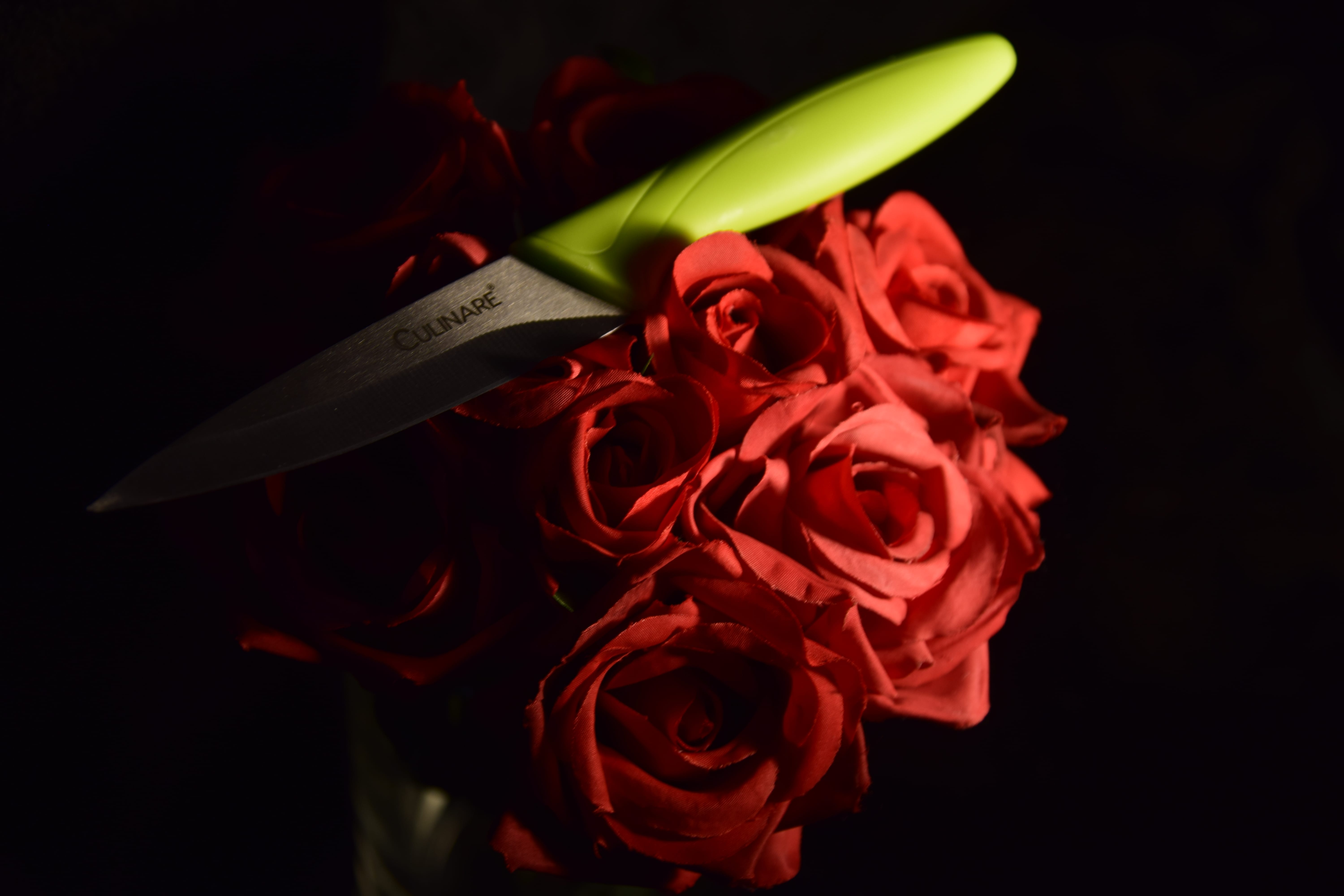
Here are some of the photographs I have not used for my final project:

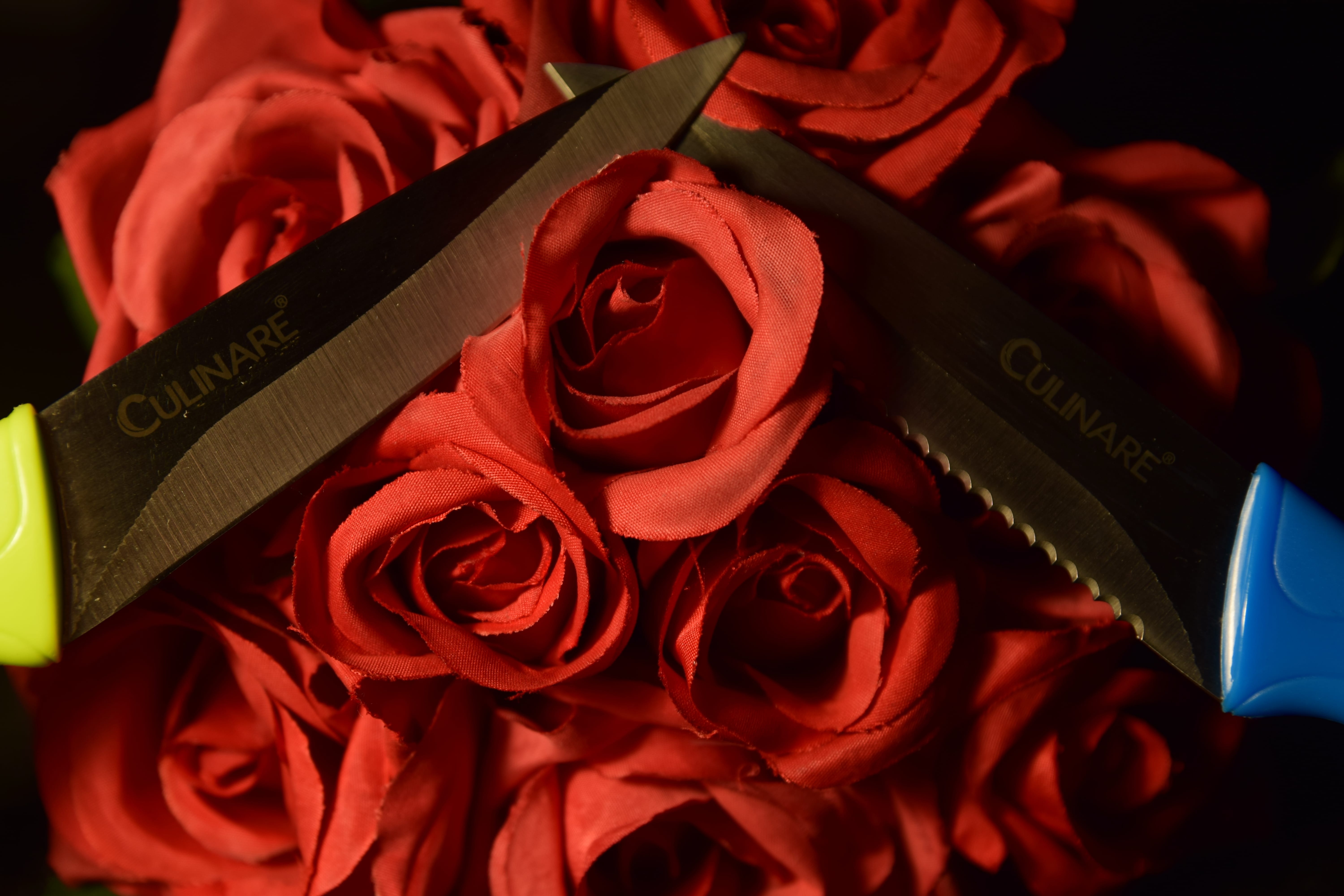
This specific photograph relates to the antonyms ‘Love and Hate’ as the flowers metaphorically represent ‘love’ and the knives metaphorically represent ‘hate’ because they are sharp and dangerous. As soon as I took this photograph I knew that it would be one that I would not even consider using as one of my final photographs due to the fact that it has a lot of issues with it that does not make a good photograph. Firstly, the lighting in this image is really bad as the flowers are really dark and then there is light reflecting off of the knives which causes a glare for the viewer to look at. Moreover, the image overall looks very red and as this was one of the first photographs that I had take for this antonym – however, I later realized that the settings for the white balance were wrong, which is what made the overall images look a funny colour, so once I was able to figure this issue out, I was then able to construct better photographs. Furthermore, I do not really like the composition of this photograph as the ends of the knives are just going out of frame – which makes the photograph look messy and rushed – however, I do like the placement of the objects, but I believe that I should have just sorted out the lighting more and tried shooting from another angle. Overall, I am clearly able to see my mistakes when I took this photograph and I personally think I improved on them which can be seen in my final photograph.
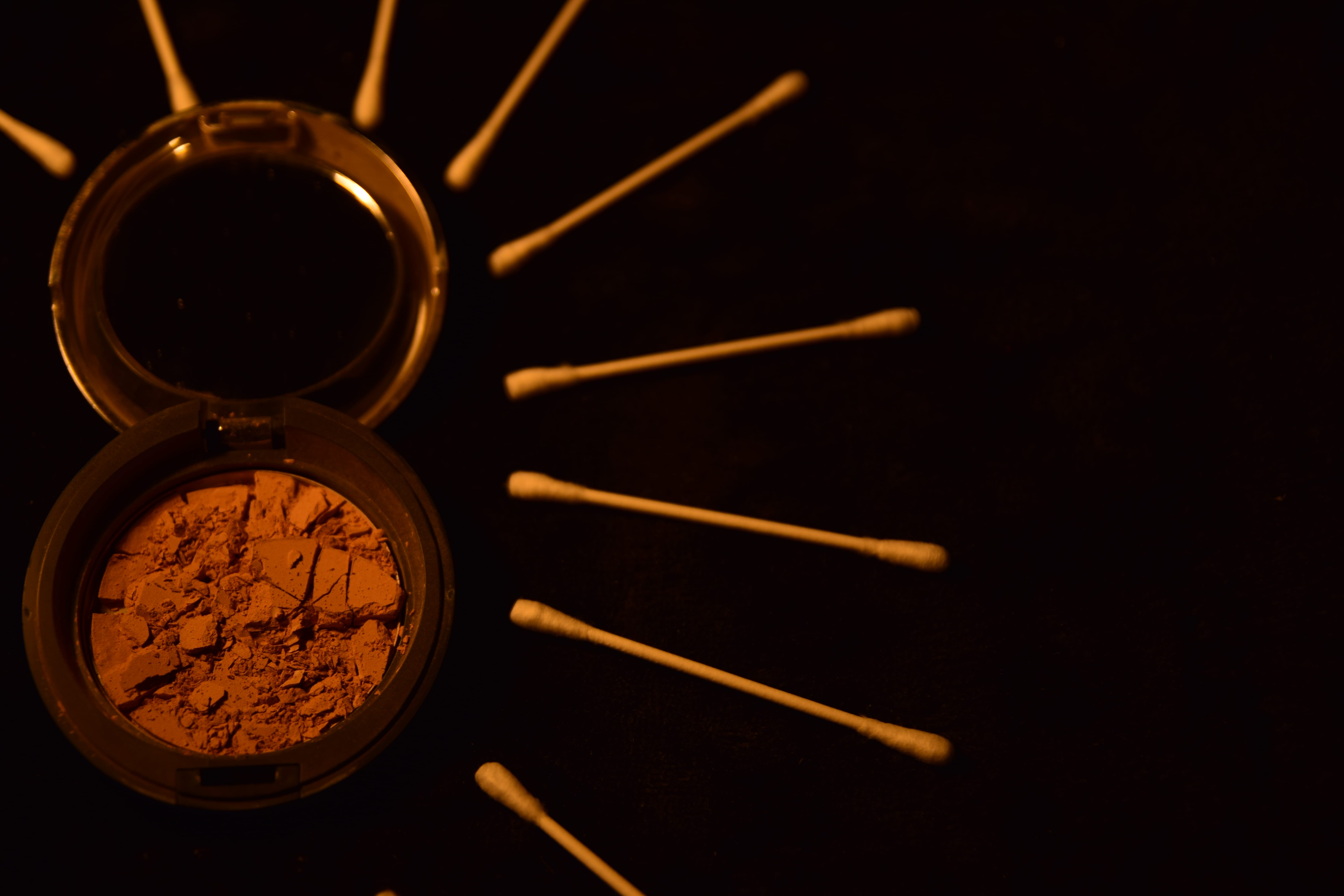
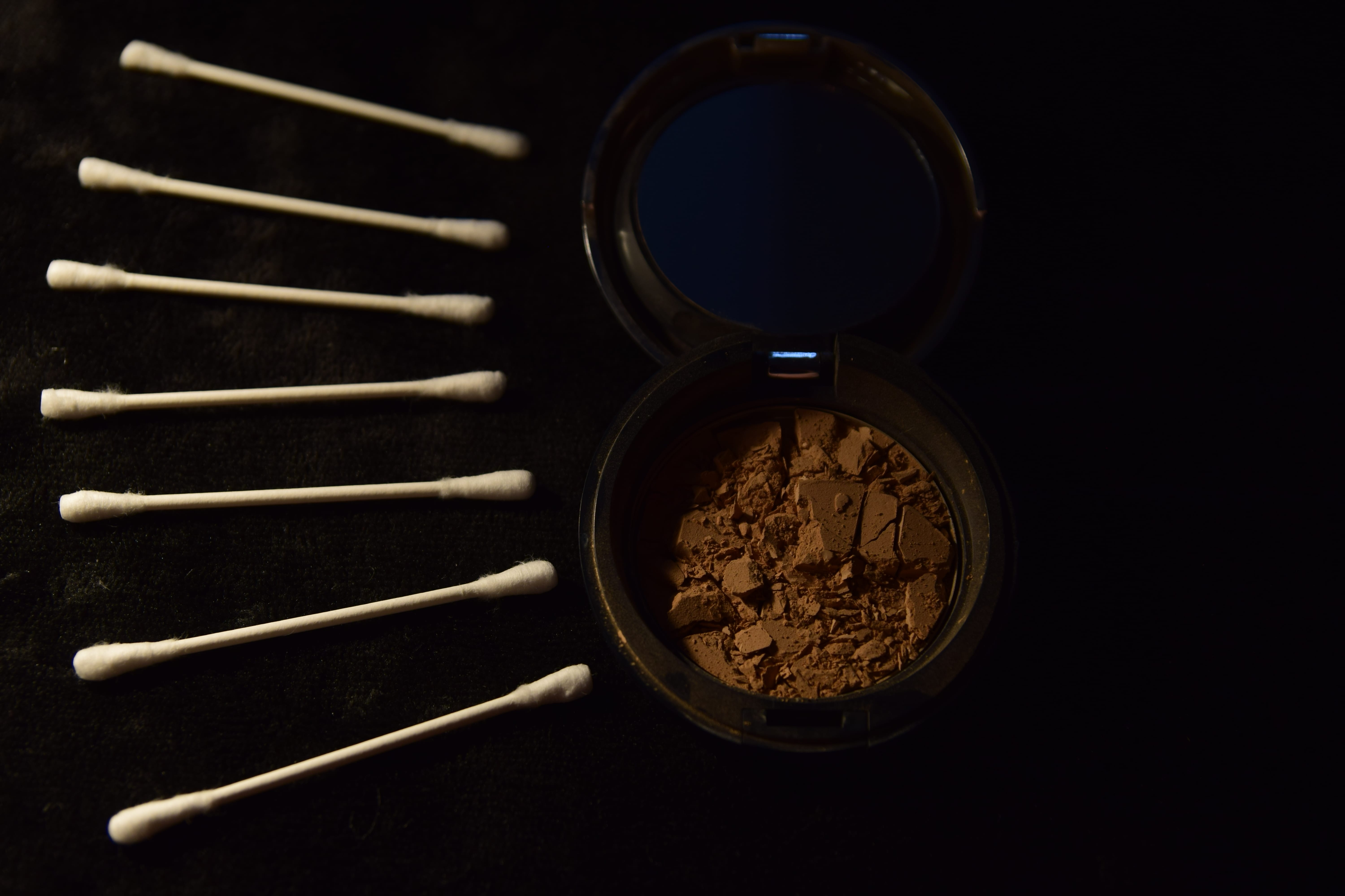
This photograph related to the antonyms of ‘Confident and Shy’ – where the ear buds metaphorically represents ‘Confidence’ as they branch out and the crushed and broken make up metaphorically represents ‘Shyness’ as it is broken and hidden away from the confidence. Again, there are quite a few issues that can be seen within this photograph and the main one again is lighting – I think when I first starting taking photographs for each of the different objects, it took me a while to get the lighting right and in this specific image, you are able to see that the top half of the image is lighter than the bottom half – which again was due to the positioning of my lighting. I think that the difference in soft lighting and hard lighting would have been good in this photograph to differentiate the contrasting antonyms – however, due to the positioning of the objects, it would have been hard to do as the ear buds were surrounding the whole of the make up pallet. This also links in with the composition of the photograph – which again is not that great. You are able to see that the photograph itself is not actually straight and although the majority of the objects take up most of the frame, it takes up more of the left side of the image rather than it being equal – which again looks unprofessional as there is more blank space on the right side of the image. All in all, I learnt from these mistakes and was able to improve when it came to taking my final image for these specific antonyms.
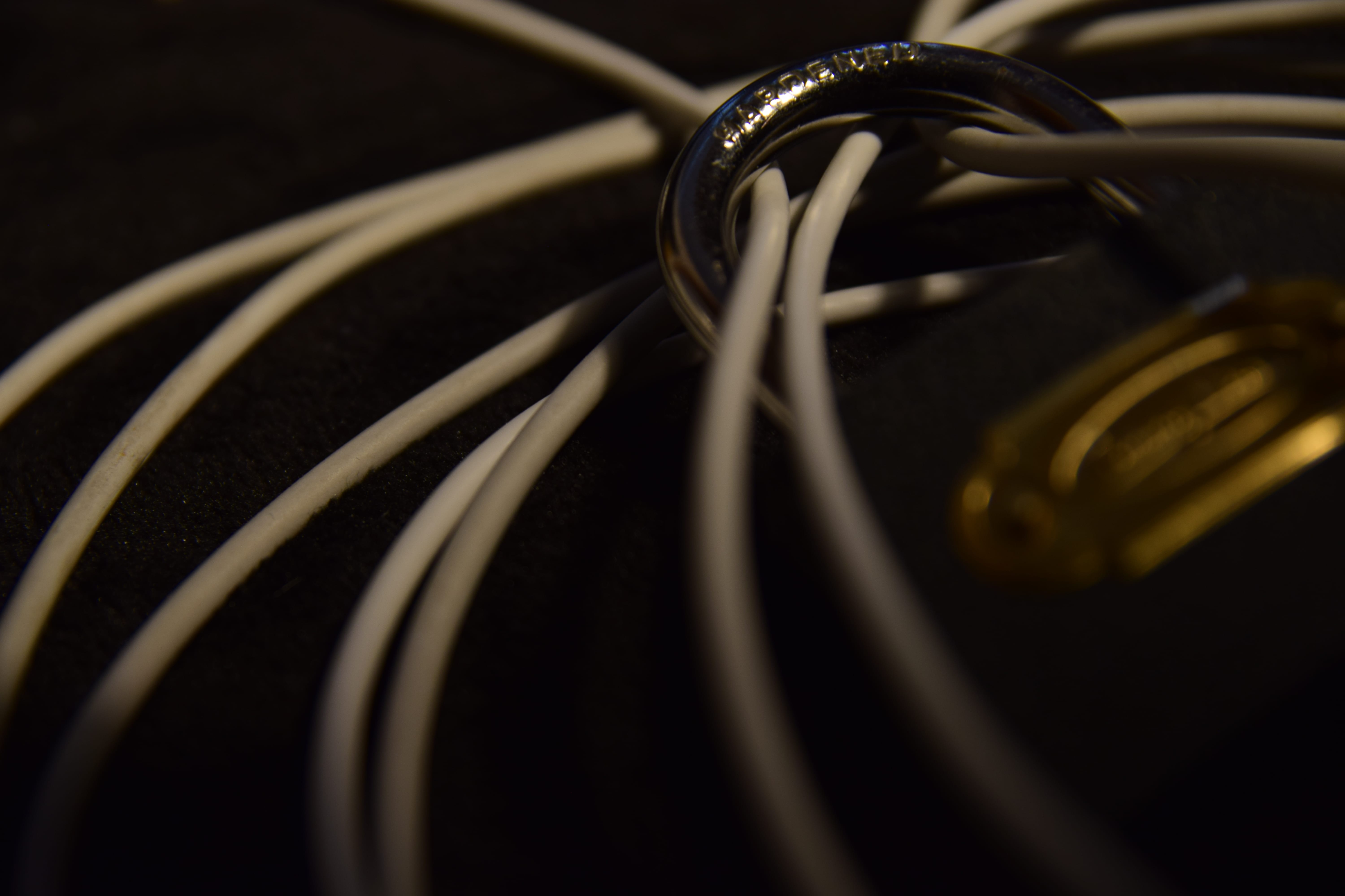
This photograph has been used to represent the antonyms ‘Noisy and Quiet’ – where the padlock has been used to metaphorically represent ‘Quietness’ as it has been shut out and the cables have been used to metaphorically represent ‘Noise’ as they are all over the place and have a lot going on. I personally do not think that this photograph is as bad as the previous two that I have already spoken about – however, there are issues with it, which is why I did not want to use it as one of my final photographs. Firstly, you are able to see that this image is not completely in focus – however, I did find this quite appealing as it puts more focus onto how the cables are locked between the padlock rather than showing the whole of the padlock, but due to the fact that I was not certain about this concept, I decided not to use this photograph as my final one. On top of that, you could perhaps say that the lighting is too dark, but I do like the lighting that has been used in this photograph as it represents the contrast between being noisy and being quiet. I think that the main issue with this photograph is the composition as the majority of the photograph is the cables, which in a way makes sense as they are representing noise – however, I believe that the padlock should have perhaps been in the photograph more. Nonetheless, I was again able to improve on these issues and come out with a photograph that is being used for my final independent project.
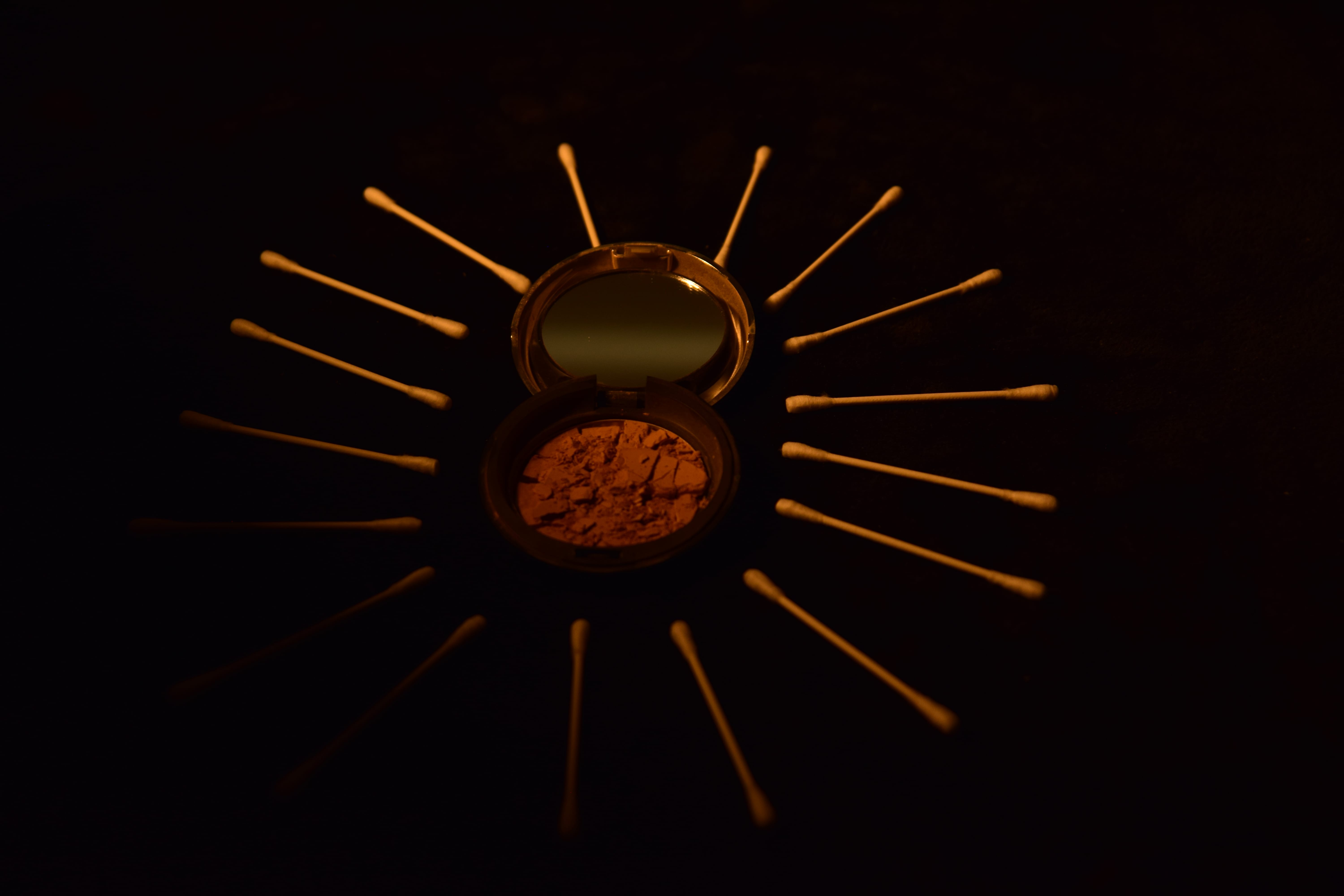
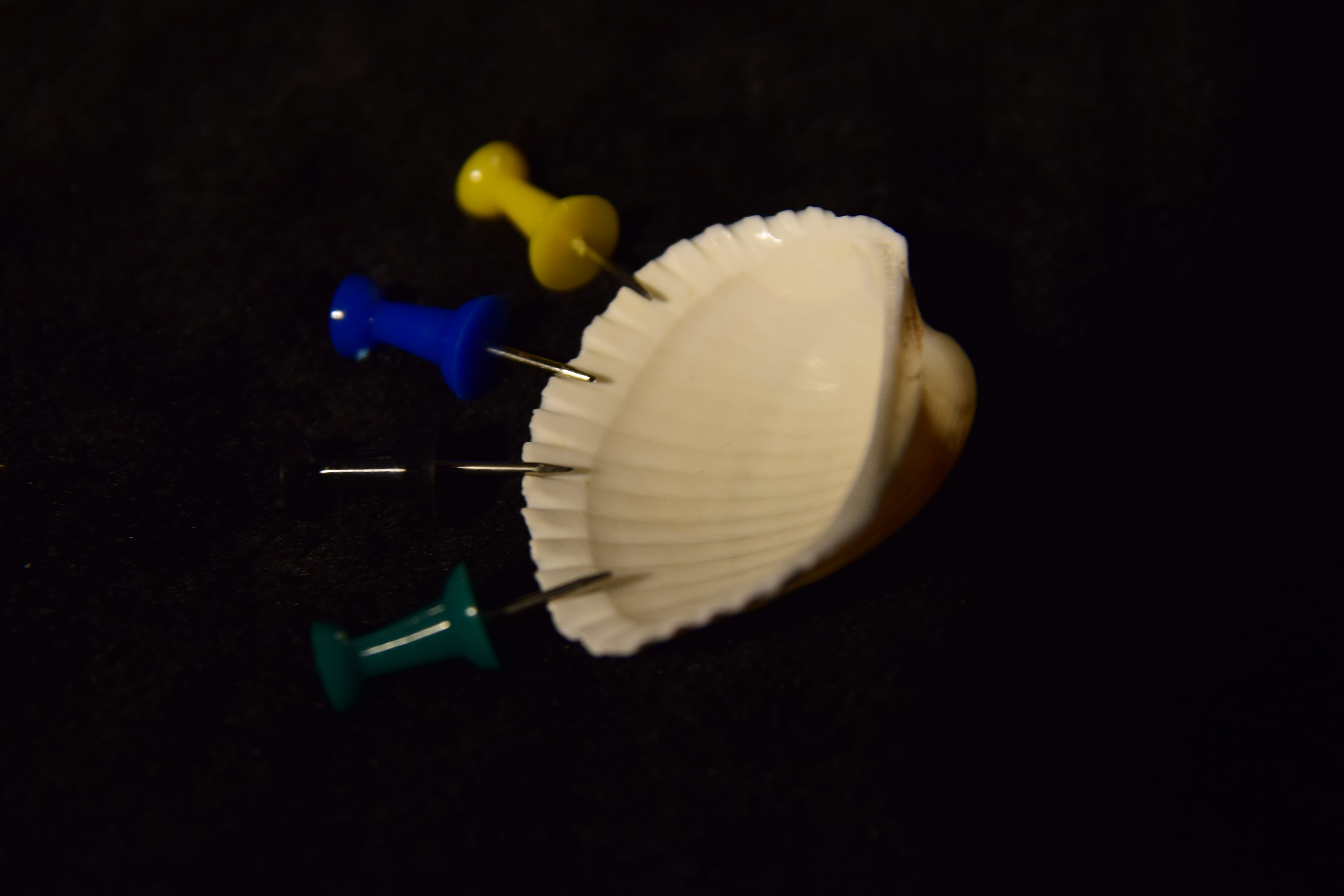
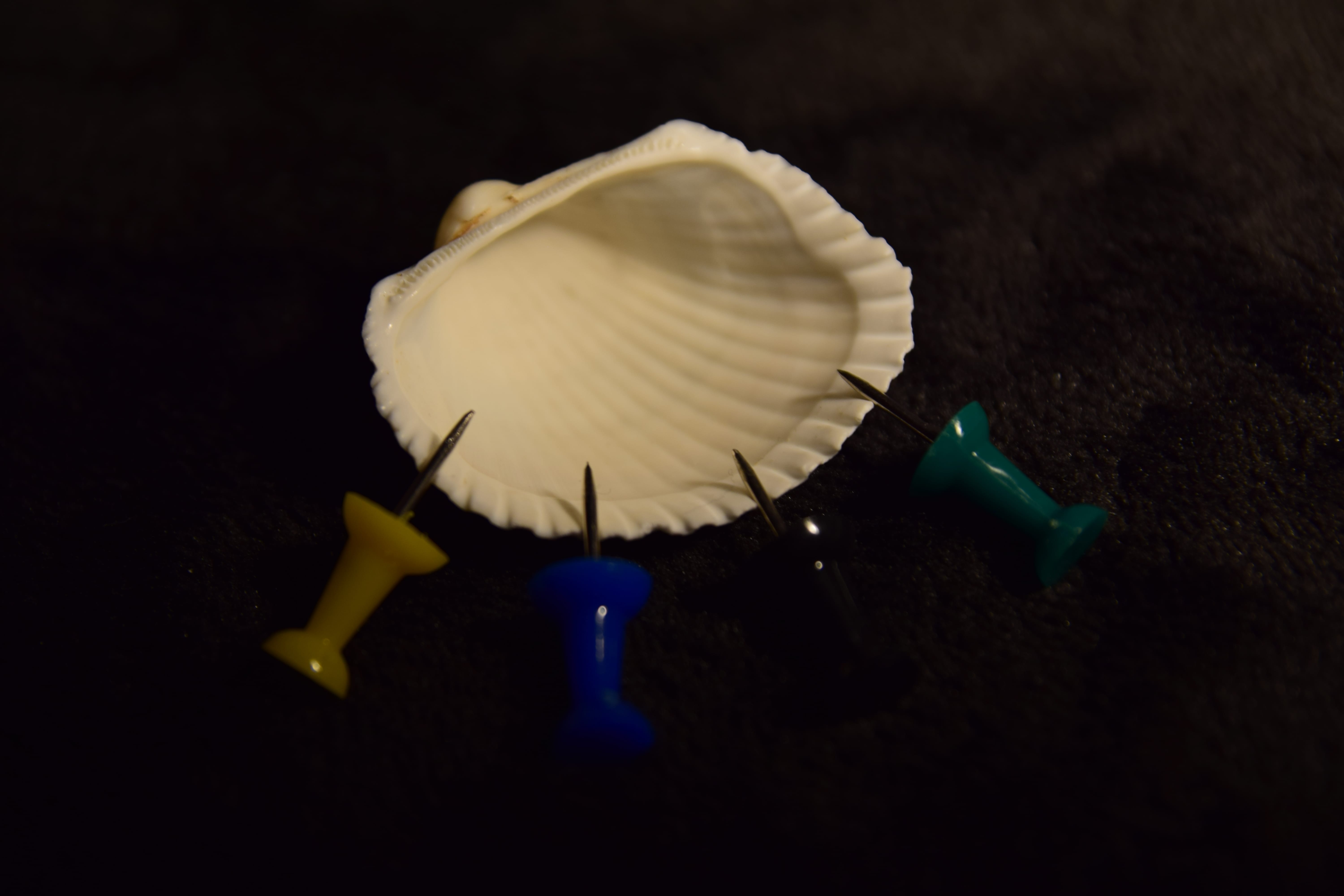
This photograph represents the antonyms of ‘Calm and Anxiety’ – where the sea shell has been metaphorically used to represent ‘calmness’ as it is associated with the sea – which is often conforms to the theme of calmness and the board pins have been metaphorically used to represent ‘Anxiety’ as they are sharp and can cause pain to anyone or anything that it touches. Again, I personally think that this photograph is not as bad as the first two that I had looked at, but again there are issues with it, which is why I did not use it as one of my final images. The main issue with this photograph is the composition again as there is too much space surrounding the object which appear in the center of the photograph and although it is good that there is space between the objects and the side of the frame, I feel like there is too much in this specific photograph. Moreover, although the lighting is not that bad, I believe that it is just a little bit too bright and could perhaps been darkened a bit, but as well as that, I feel like a more interesting lighting technique could perhaps be used as there are no shadows being cast and the image overall looks a little dull. All in all, even though I noticed these issues that I was having when trying to take photographs for these antonyms, I was able to fix them and ensure that my final photograph for my final independent project looked good and up to my own standard that I would be happy with.
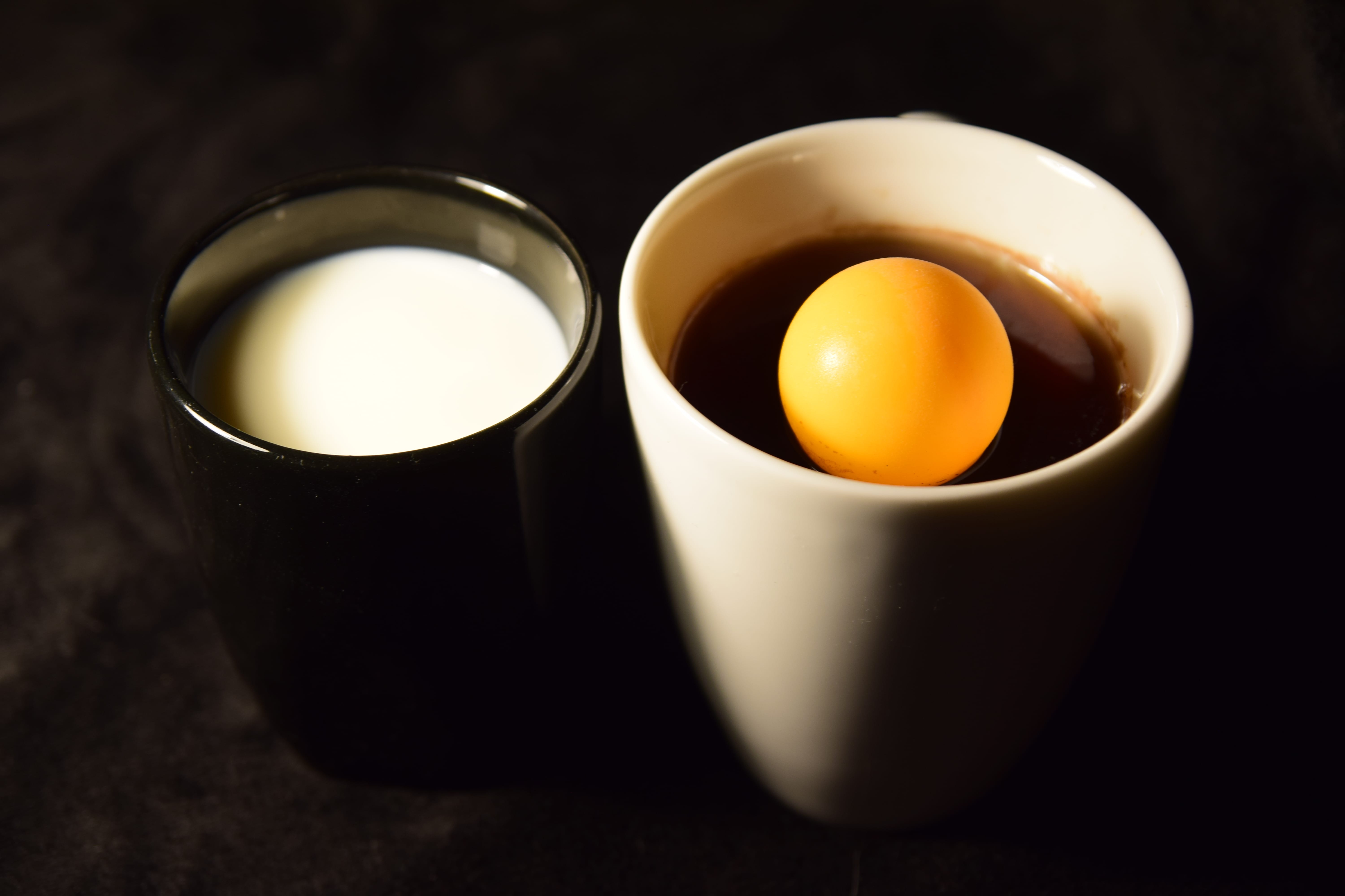
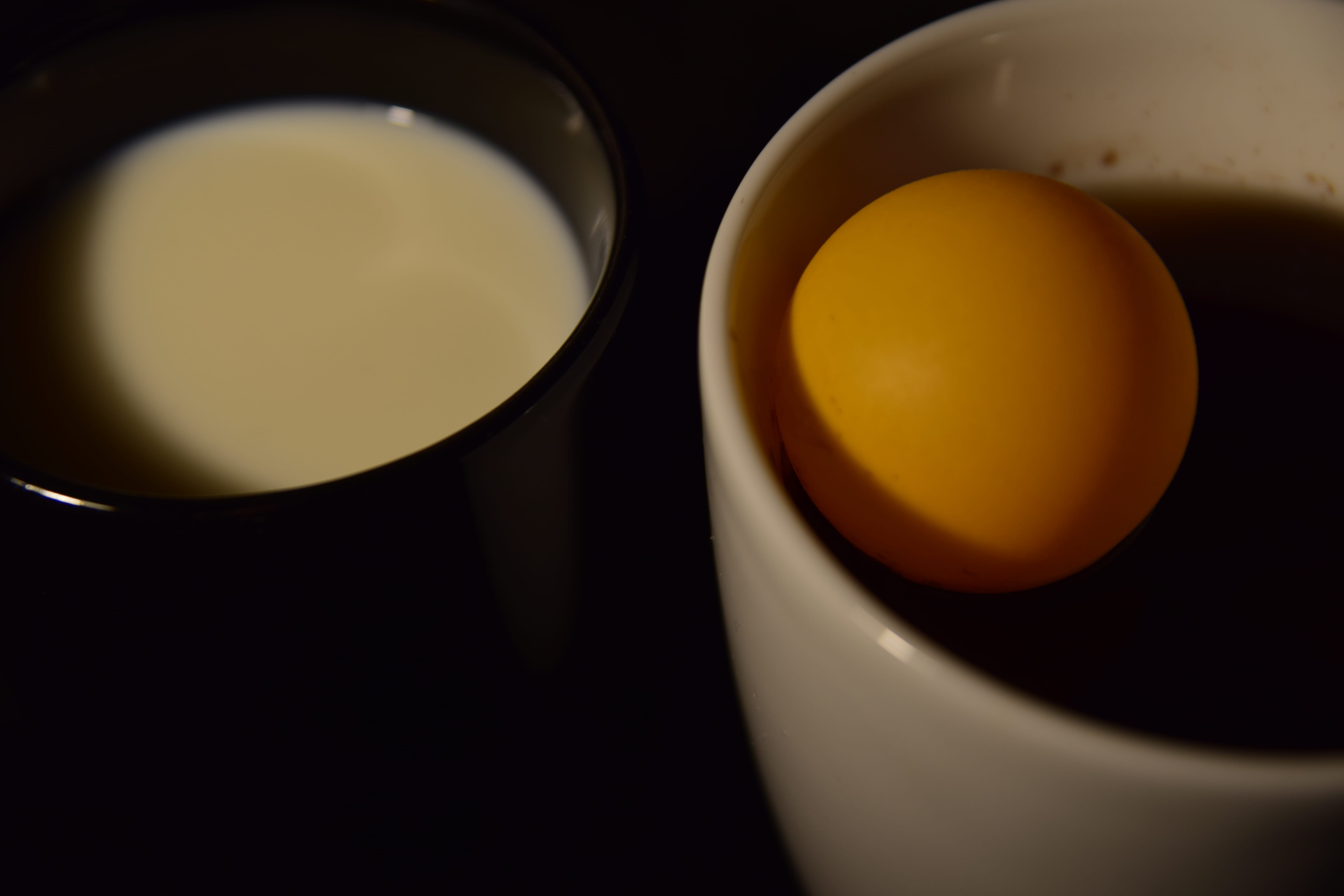
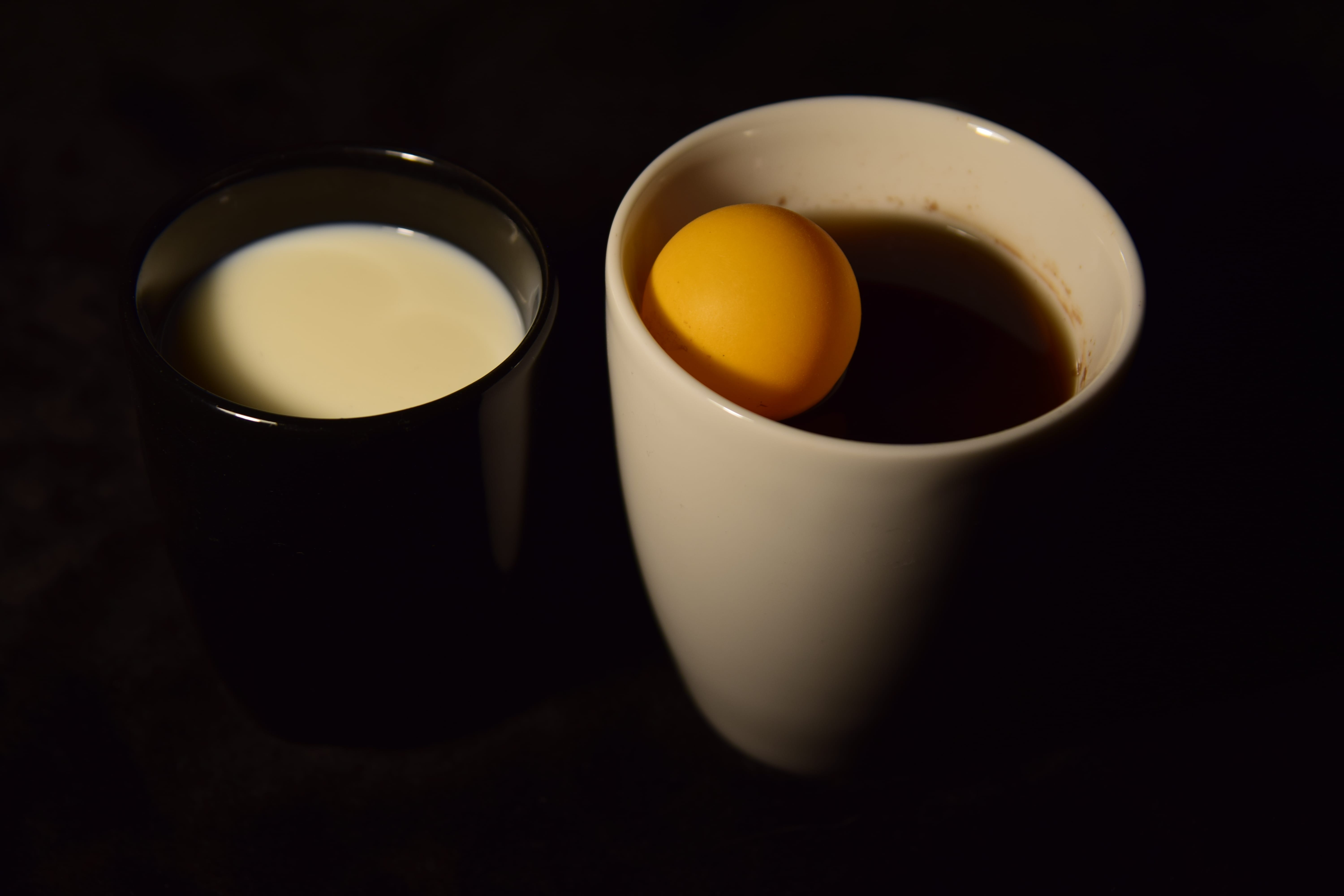
Lastly, this photograph has been used to represent the antonyms ‘Life and Death’ as the white mug with the ball has metaphorically been used to represent ‘Life’ as the colour white presents that they are still alive and the black liquid expresses they are functioning on the inside – which is also reinforced by the ball that expresses life. The black mug has been used to metaphorically represent ‘Death’ as the black demonstrates that they are deceased and there is no more life and the use of the white liquid expresses that there is nothing more happening inside someone as white is plain and bland and does not have much of a function. The main issue with this photograph is the lighting as you are able to see that it is way too bright and produces a big glare which the viewer will have to look at – however, I do like the slight shadow that has been produced from the mugs at the bottom of the photograph. I would not say that there is an issue with the composition as both of the mugs have been positioned next to each other and are in the center of the frame and there is another blank space on the left and right side of the photograph – meaning, there is not too much blank space, but at the same time, there is not too little. Overall, I think this photograph would have looked a lot better if the lighting that I used was better as I believe that everything else was fine – nonetheless, I was able to improve on this lighting issue and was able to come out with a better image for my final project.
Alternative Photographs
When it came to choosing my final photographs, there were multiple images that I had taken, so I had to look at them all in detail to ensure that I was certain that I was selecting the right photographs that I wanted to use for my final independent project. As I have now finally selected my final five photographs, I have decided to present some of the photographs that I was potentially thinking about using as my final five in this post. Below you will be able to see some of the alternative photographs that I could have potentially used as my final photographs:
Again, some of these photographs are better than others – however, they were all considered to be alternatives for my final independent project. From looking at the photographs you are able to see that with the images that are used for the same antonyms (for example: Calm and Anxiety) you are able to see that the placement of the objects is often the same and this is due to the fact that I believe after a certain amount of time I did find the right positions for the objects and ended up taking photographs of the objects in these positions to ensure that I would be able to select the right image were all of the imagery inside of the frame is as perfect as it can be. These photographs did not make it to my final five due to the fact that although some of them are good, I do not believe that they were good enough to be part of my final photographs because they all had some minor issues with them – which was either in relation to lighting, focus or composition. Nonetheless, I am happy with my final outcome and the photographs that I have constructed throughout this module.
Project Reflection
I personally believe that I have been through a lot when it came to constructing my final photographs for my independent project as there was a lot of time and effort that had to be put into everything to ensure that I could come out with the best possible work that I capable of creating. Firstly, I am personally not a lover of photography which is why I think I found it hard to do this module. I was easily able to think of an idea for my independent project as I know I wanted to do something metaphorical that people would have to think about deeply so they would be able to interpret the photographs in their own way, but also they would be able to try and figure out what meaning I was wanting to portray to the audience. I believe that the three mini assessments we had – ‘Appropriation’, ‘Still Life’ and ‘Portraiture’ were extremely helpful throughout the semester as they enabled me to understand more techniques in relation to Photography and how I may be able to include these into my own final independent project photographs. I did struggle over time with these assessments due to the fact that again it is something that I do not personally enjoy – however, they did help me in understanding the camera more – which again was beneficial in the end as it enabled me to be prepared for my final photographs for my independent project. If I did not do these assessments then I think I would not have been prepared enough for my final project as I would not have had enough practice with the camera and the functions that it can do.
Furthermore, when it came to my final project, I believe that I have done well for what I know – however, I know there are certain elements I could have improved on. Firstly, I am happy with the concept that I came up with in relation to the antonyms for the theme ‘Division’ as I believe the concept of antonyms is interesting for the audience as they are able to see the contrast between different elements and how they may work together, but also, I believe that it was intriguing to do in relation to the theme of ‘Division’ as it presents how again, certain features can be diverse from each other and will contrast and create a specific meaning. Moreover, when it actually came to taking my final photographs, it did take me a long time as I wanted to ensure that I could get the photographs to look as good as possible in relation to what I was capable of – which meant that I had to try out different angles, lighting and positioning – meaning, it took me a long time just to get five final photographs as I also had to go through all of the images I had taken to ensure I chose the right one for me. From looking at my final photographs, I am able to say that I am happy with how they turned out – including: the lighting, composition and angle – however, I think there are a few changes that I could have made – such as: trying out more lighting techniques when both taking the photographs and during editing, but also I think I could have perhaps asked individuals on their opinions of my final work – however, this could have been hard due to the fact that everyone has their own ideological views and will interpret and see things in different ways.
Nonetheless, I believe that all of my photographs do link well together and enable the audience to understand various divisions/antonyms and the issues that may lye within them – also, within in all of these photographs, you are able to see that I have used dim lighting and this was essentially my plan due to the fact that a lot of the antonyms are feelings and emotions that people often keep hidden away, so the dark lighting enabled me to express how people should essentially tell people abut their hidden and dark feelings. Overall, I would say that my favourite photograph is the ‘Love and Hate’ photograph that includes the flowers and knife – this is personally my favourite due to the fact that I believe it has the best lighting, composition and focus. This was also the very first antonyms that I decided to photograph – which meant that I was more relaxed and willing to try out numerous things – meaning I was able to easily select my favourite photograph out of all of the ones I took with the flowers and knives. All in all, I am glad I was able to have to opportunity to try out various features in relation to photography and look at different visual elements to ensure that my work and the worked that I had researched appealing to an audience.
Bibliography
Google.com, Division Meaning. Available from https://www.google.co.uk/search?ei=cxGTWtf9GorKwQLquLPYDw&q=division+meaning&oq=division+meaning&gs_l=psy-ab.3..35i39k1j0l9.2237.3000.0.3152.8.8.0.0.0.0.134.757.5j3.8.0….0…1c.1.64.psy-ab..0.8.755…0i67k1j0i131i67k1.0.JCJV9RrXgyM (Accessed on 24th February 2018)
Miriou, Crisia (2014) The Selfies: Social Identities in the Digital Age [Online]. Australian and New Zealand Communication Association. Available at: https://www.anzca.net/documents/2014-conf-papers/796-the-selfies-social-identities-in-the-digital-age/file.html (Accessed on 9th April 2018)
James, William (1950) ‘The Principles of Psychology’ in Crisia Miriou: ‘The Selfies: Social Identities in the Digital Age’ [Online]. Australian and New Zealand Communication Association. Available at: https://www.anzca.net/documents/2014-conf-papers/796-the-selfies-social-identities-in-the-digital-age/file.html (Accessed on 9th April 2018)