My very first Photography workshop was essentially split into two parts – discussing the course and taking photographs in relation to the term ‘Appropriation’. The first half of the workshop was all about our tutor explaining to us what we would be doing on the course throughout the weeks and what we should do if we ever had any issues. For the second half of the workshop, our tutor decided to take our group out and around Lincoln to take images of anything related to faces – which is the theme we were given for our ‘Appropriation task’. The concept of ‘Appropriation’ is all about setting something apart for a specific purpose or use and to essentially take something that is already existing and steal it without the permission of the original owner – hence our group taking photographs of existing images around the city as we did not know the original photographer and are therefore stealing the images. When taking these images I needed to take into consideration how these images would be angled when photographed, but also what meaning they may be trying to convey towards the viewer and what impact this may have on them.
There were a variety of images related to the ‘Face’ theme when I was looking around Lincoln and they were all diverse in their own way – some used unique angles, some promoted different elements, but they were all eye catching in their own way. I did take multiple images when I was out with my group – however, I have only presented four of these images below and I have added a description for all of them which explains what I like about the image and the reason I took the photo from the angle that I did.
Here are some of the images I had photographed:
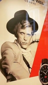
I found this image in the shop window of a watch shop and I personally found it really eye catching and appealing mainly due to the features that have been demonstrated in the original photograph. All the focus is mainly on the individuals eyes which I found really appealing – simultaneously, he is also directly addressing the viewer which entices them and keeps them more engaged in the overall image. Furthermore, I also like the use of primary colours (black, white and red) which again makes the viewer pay attention to the eyes the most. I decided to take a portrait image of the whole of the photograph because I believe that the whole image has more of a meaning than just a specific feature – for example, if I just took an image of the eye than it would not have as much meaning or even much of an impact because there is nothing surrounding it from what the viewers can see.
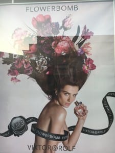
This image was also being advertised in a shop window – however, rather than a watch shop, it was Debenhams. I personally found this image appealing because of all of the different elements included and how they are all used together to create this one image. I think the most engaging feature in this image is the use of flowers in the woman’s hair due to the fact that as her hair flows outwards and upwards, it grows just like flowers, but at the same time this conforms to the meaning of the overall image as it is an advertisement for a perfume called ‘Flowerbomb’. As well as that, I think the use of the ribbon has been thought about thoroughly as it covers the females body, but she is still presented to the viewer in a sensual manner. Again, I decided to take this image as a portrait and included the whole of the image – this was mainly because I liked how all of the elements in the image complimented each other and worked well in appealing to the viewer and to entice them. The only issue with this image was the fact that I got a reflection at the top of it – however, this was unavoidable and I wanted to get a photograph of the whole image rather than just a specific feature.
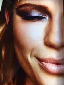
This image was taken inside of ‘New Look’ in the make up section and I liked it because of the close up of all of the features on the woman’s face – these close ups enable the viewer to admire all of the woman’s features, but due to the fact that this is an image to advertise make up, the viewers are able to see how particular make up is presented on someones face. As the woman’s eye is closed, the viewer is able to look closely at the eye shadow that has been used – which may lead the viewer onto purchasing the item. Moreover, the woman is also smiling in the image – this could possibly entice the viewer more due to the fact that the woman is happy – therefore inferring that if the viewer purchases the make up, then then will be as happy as the woman. This photograph was again taken as a portrait – however, I decided to not include the whole of the face and I believe that it looks better as half of a face because the viewer only needs to view one of the eyes and half of the mouth to see the make up that has been used, but at the same time, I like the shadows that have been used as the face has been illuminated with light, while the hair and cheek is surrounded with a shadow.
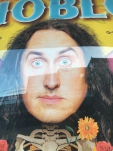
This photo was taken from a music poster outside the University of Lincoln’s ‘Engine Shed’. I liked this image again mainly due to the individuals eyes as they are eye catching and appealing for the viewer to look at. In this image the main focus is not on the eyes – however, I feel like it is the most appealing feature because they are wide and make the viewer want to look at the image. Again, this is a portrait photograph and although the original image was a lot bigger and had more features on it – including more people, objects and text, I decided that I wanted to just take a photograph of this individual because of his eyes and how they appeal to the viewer. When taking this image I was not intentionally planning on there being a reflection going across the eyes of the individual – however, once I had taken the image I noticed that it actually benefits the image and displays the eyes in a stronger manner to ensure that the attention of the viewer is on them and that they are enticed into the image and what meaning it may be trying to convey to the viewer.
As well as looking at my own images in detail and discussing why I liked them and why I photographed them in the way I did – I was also told to take a photograph that someone else had taken for this project. I decided to take Melissa Minshull’s image from her Instagram account ‘mmelonish’. When looking at certain images to take and analyse, I decided that I liked this image the most mainly due to how specific features have been presented and conveyed towards the viewer. Firstly, I can already tell that this is an advertisement for a watch, which most likely would have been advertised in a shop window – this is obvious due to the image of the watch that has been presented in the bottom right hand corner. I like how the subject (David Bowie) is directly addressing the audience – which could potentially lure them in and make them want to purchase the watch. Simultaneously, I like how a streak of solid red has been used as it slightly cuts the image off, but the viewer is still able to see everything that is going on in the image and how a certain meaning is trying to be conveyed towards them. If I took this picture myself then I would have personally tilted the camera a bit and got closer to the subjects face as I feel it would have a greater and stronger impact on the viewer and how they may understand the image.
Overall, I believe that all of these images were appealing and interesting to look at for a variety of reasons. They were all diverse in their own way and had different ways of advertising something or trying to convey a particular message to the viewer. Nonetheless, by taking all of these photographs of images, I am able to understand why certain features and elements are used in some images and how particular elements can be used to attract and appeal to any viewer.
