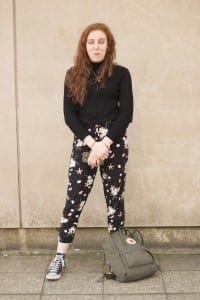
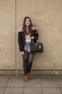
During this weeks workshop, our tutor decided that we would go outside in smaller groups and take portraiture photographs of other people in our groups, strangers or even someone we knew that was just passing by. This workshop was mainly about looking at the lighting that is used and how we would be able to control it. At the beginning of the workshop, our tutor showed us three photographs – one which uses a long shot of a subject, one which uses three quarters of a subject and another which uses a close up of a subject. We were able to look at these photographs in detail and analyse them in the way that we would be able to understand them and hopefully use certain elements and ideas in our own work. We were able to look at how particular apertures and shutter speeds were used to make the photographs appealing to the viewer. Once we had looked at these photographs, we then went outside in our groups to take some portraiture photographs using these three different shots for 30 minutes – I had both Rhianna and Cassie in my group. I felt like doing this was quite enjoyable and I was able to understand how to control the various lighting and equipment used in more detail, but at the same time I was able to comprehend how hard it may be to take portraiture photographs when you have no way of controlling the light. Once we had taken these photographs, we then went back to our class room and showed each other the photographs we had taken – in this time we were able to say what we liked and disliked about each others photographs and how we would all be able to improve them. Below you will be able to see some of the photographs that our group had taken for this task and again there are both good and bad photographs that came out of the shoot.
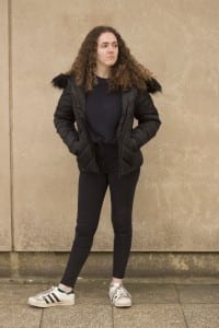
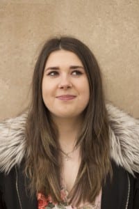
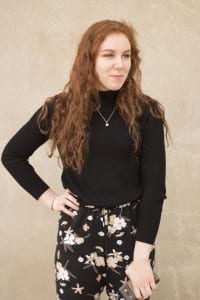
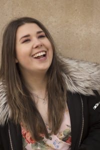
Here are some of the photographs I took that I think turned out well:
From looking at these photographs, you are clearly able to see that they are not perfect as they do have some issues with them – however, these are some of the better photographs that our group had taken during this shoot. Both the first and second photographs contain the members of my group – Cassie and Rhianna – however, the last photograph contains one of my friends (Naomi) that was walking by while we were doing our shoot. I like all of these photographs because of the poses that the subjects are doing as they are looking away from the camera, which will make the viewer think that they are looking at something interesting and will want to know what is being looked at, so will be able to think about this for themselves. Out of all of these photographs, I would perhaps say that the second one is my favourite due to the fact that I like the colour that can be seen in it and the majority of the photograph is in focus – the only issue that I think I have with this photograph is the composition as I think that there is too much space above the subjects head, when instead the camera could have been moved down a bit more – nonetheless, I still really like this photograph. I do like the other photographs as well – however, my main issue with the first photograph is again the composition as there is a random line that appears on the wall in the very left of the photograph and I believe that this could have been thought about more – but also, in the third photograph, I think the subject should be centered more rather than being more to the left side of the photograph, but again this is all something I could improve on. Nonetheless, I was able to try out the three different shots that our tutor wanted us to do during this shoot.
Here are some of the photographs that did not turn out as well as the ones above:
I personally do not like these photographs for a lot of reasons, but I mainly think it is because of the composition of them. I know that when we were taking these photographs, all of the subjects laughed due to the fact that we were in a public space and it meant that a lot of people would watch to see what was occurring and because of this it meant that some of the photographs did not turn out as well. Firstly, I feel like the subject in the first photograph is taking up too much of the frame, but simultaneously, she is also positioned to the left of the frame – which makes the overall photograph look unprofessional and out of place. I feel like the lighting in the second photograph is too light and you are able to see that the subject was not prepared for the photograph due to her facial expression. As well as this, you are able to see that the camera was wonky as the line on the wall is not directly vertical – which makes the overall photograph again look unprofessional – nonetheless, I like the use of body language by the subject and the way that her bag has been positioned on her. In the last photograph, the main issue again is composition as the subject is too close to the horizontal line on the wall – which looks out of place and unappealing on camera. Moreover, I believe that this photograph was taken too far away and that there is too much of the ground and room above the subject apparent in the frame. I personally think that during this shoot we should have tried out more locations to practice with various lighting more – but overall, I am able to see that our main issue was with composition and occasionally focus. Nonetheless, I am glad that I was able to see where my weaknesses lye when it comes to portraiture and especially controlling the light as I will be able to improve for next time.
